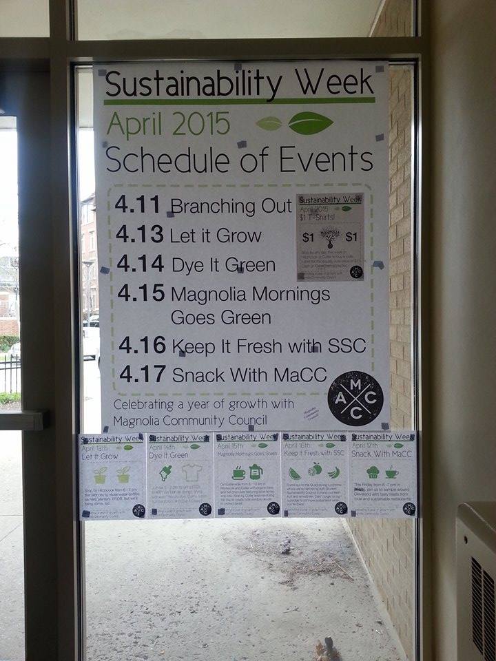
Sustainability Week
As Magnolia Community Council’s PR chair this year, it was up to me broadcast our end-of-year event to first years and students within our environmentally-focused residential college. Throughout many, many meetings, our event began to take shape: 7 days of activities, volunteering, and food, all aimed at bettering our surroundings. According to our advisors, last year’s council had thrown a similar event and its attendance was negligible. As in, we could safely call this the inaugural Sustainability Week.
An issue we had been struggling with all year was a logo. People would look at posters with our abbreviation (MaCC) and ask where he was! By creating a logo, I hoped that people would recognize that we were a subset of RHA and were in fact our own organization.
Logo
While the council agreed we should have a logo, no one was really sure what it should look like. Deciding to not get tripped up on those minor details, we talked about some simple shapes as starting suggestions. I played with a couple, and decided on a round stamp that reminded us of the globe on the Magnolia crest.
After some controversy on the orientation of the letters, the logo was approved by the council.
Flyers
The logo would be used on all of our flyers from then on, as our main method of advertising was hanging posters in the dorms. There was a flyer created for each event, as well as one detailing the weekly line-up. Printing and hanging was left to our president’s discretion, which he did with no small amount of enthusiasm.
The posters were very large!
By creating a template that detailed the cause and reason for the festivities, students could instantly see who/what was hosting the event by recognizing the simple green, leaves, and dotted lines. Most importantly, it saved a lot of time going from creation to print. Additional flyers were created to promote the water bottle drive going on all week to gather materials for herb planters and also to advertise the themed shirts being sold for $1.
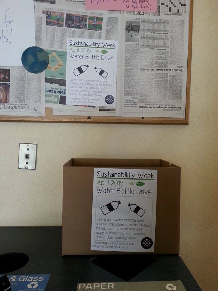
We ended up with more than we could use, but we made sure to recycle them.
Facebook Page
Each event had its own Facebook event created through our Facebook page. We encouraged people to invite their friends, since a large chunk of the events were open to all first years or to all of campus. While setting up and during the events, I posted pictures to attract more students and all to show off what a fun time everyone was having!
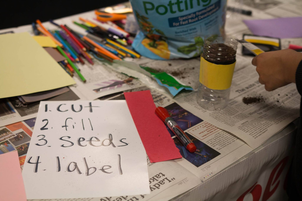
Morgan McMahon let us borrow his camera and take some of the pictures for posting to Facebook, such as during the Let It Grow herb planter event.
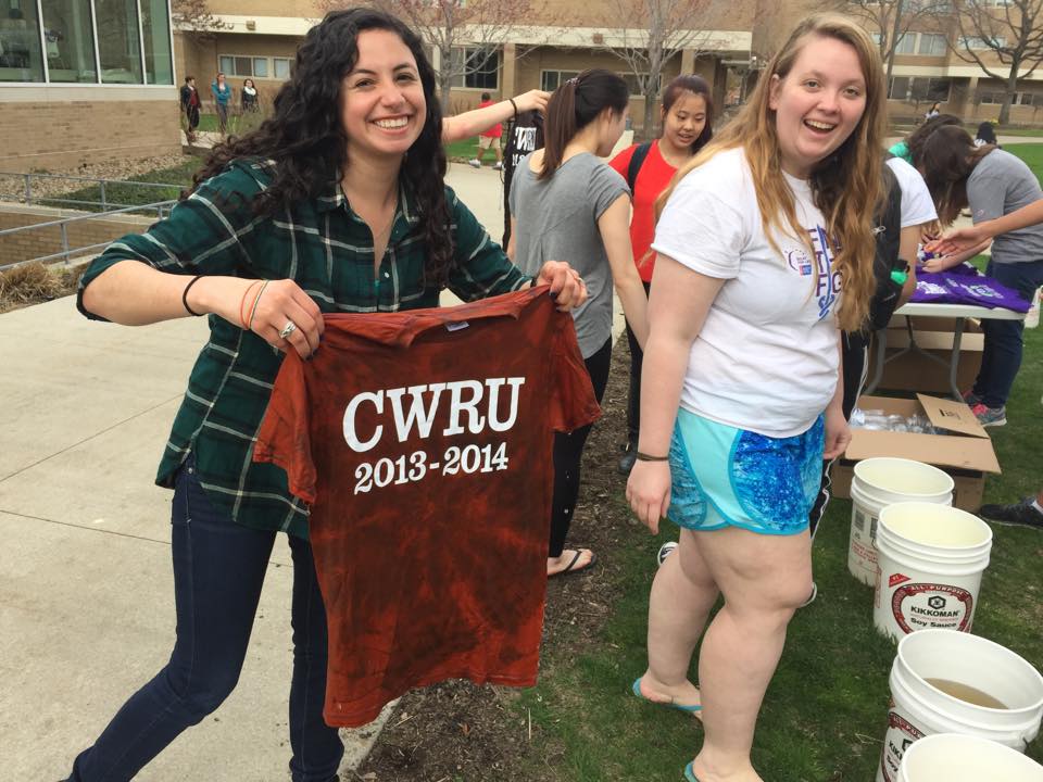
One of our events was bleaching old t-shirts - we set up camp across from the cafeteria
T-Shirts
Council agreed we all wanted some Magnolia swag, mostly because we all love free t-shirts. To promote Sustainability Week, we all wore the shirts in the week leading up and during the events and told people where they could buy them for the “super cute price of $1!″ Due to a late shipment of shirts, we weren’t able to sell them the week before as promo, but people snapped them up regardless and we’ve seen them around campus even after the week has ended.
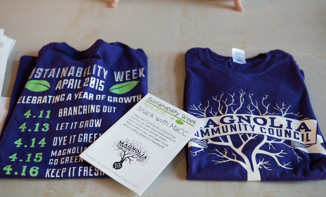
On the front, Magnolia Community Council and our new logo, while the back presented the week’s events and our sponsors.
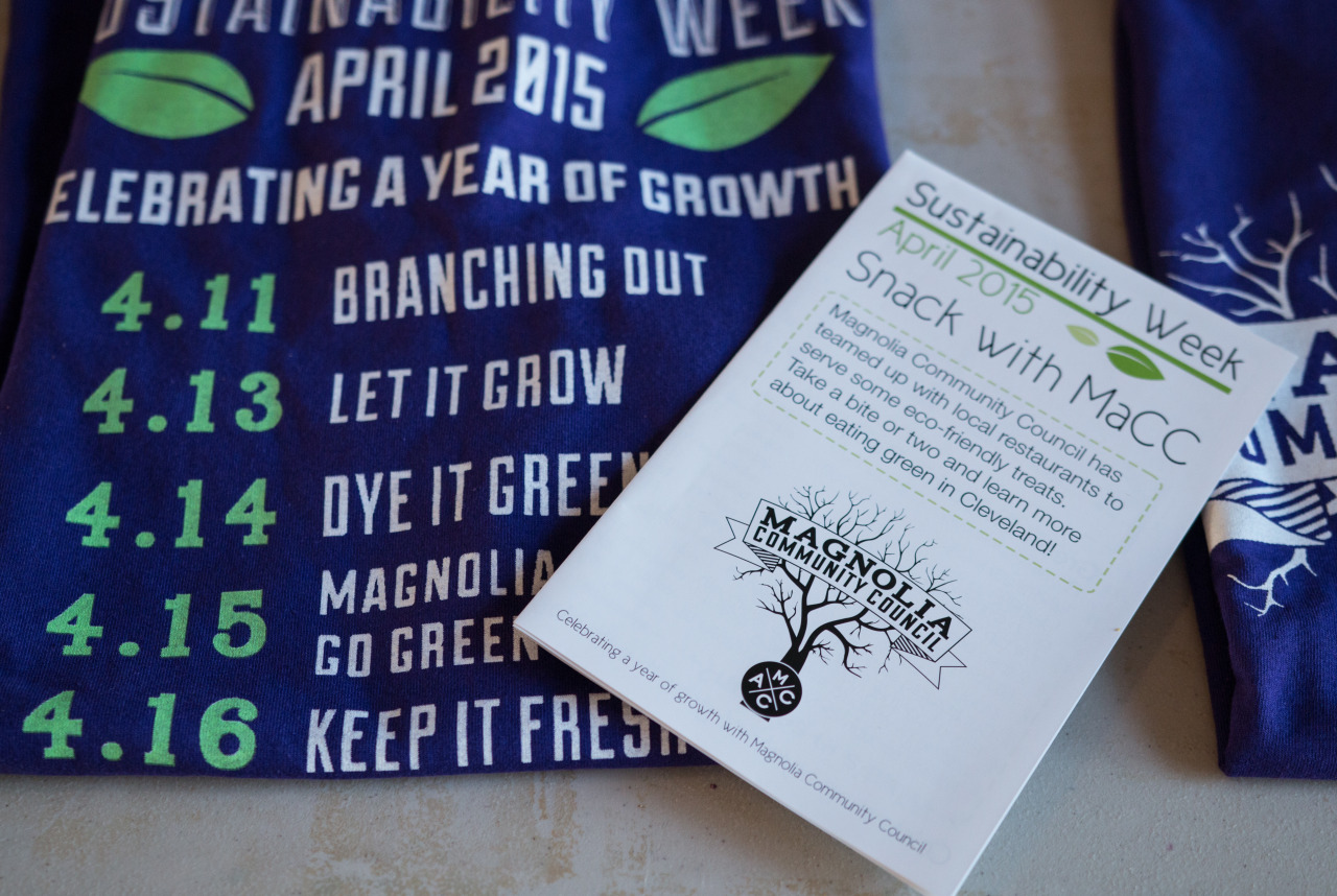
Snack with MaCC
Our culminating event of the week was a sustainable tasting of Cleveland foods, where we hoped people learned a little more about eating green. Inspired by a graphic in The Design Activist’s Handbook, I suggested we handed a brochure of what people were eating and some tips/facts, but with a twist. To encourage people to keep the flyer, it folded out into a poster for their wall! While the rest of the week’s posters were printed using a school printer, I urged us to print an unconventional size and on 30% PCW paper from a local printer to have our brochure stand out and look good, as well as stay in line with our principles of recycling.
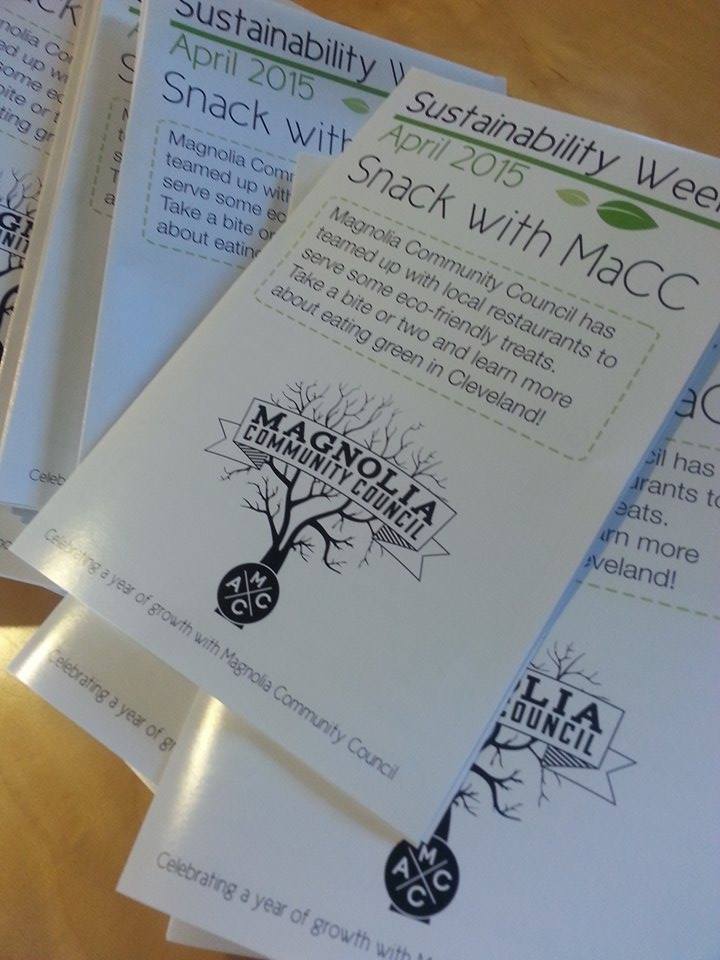
We were accidentally sent a double print of these flyers, which meant lots of folding for us! This was the largest print order we dealt with this week.
The brochures contained relevant information and notes from our sponsors, as well as notes on local farmer’s markets and a kale smoothie recipe. For the majority of the week’s branding, I had been working mostly alone and I begged everyone I knew to read over the brochure so there wouldn’t be a typo. Some of the flyers had the wrong font weight or the wrong color, which was disappointing but not devastating. I wanted the memento from this week to be perfect!
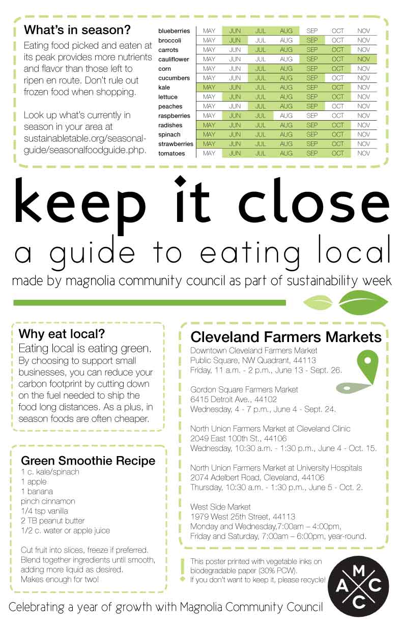
The trickiest part was making sure everything would look good while folded. Some of the margins, in person, were a little uneven - better rulers next time!
I had an amazing time working with Magnolia Community Council this year, and I’m so proud to say our Sustainability Week was a resounding success! We went on to win the Nicholl’s Cup, an award presented to an outstanding council on campus!