How I Ran an Ad Agency My Junior Year (Part 2)
After introducing design thinking to the promotions committee and defining our goals, it was time to work with our clients: other committees and students. (A rundown of how I created an agency-style team be found in my previous article: part one). Each event had its unique needs and constraints, ranging from giveaways to internal processes.
Branding
In order to be more cohesive in our language and culture towards UPB, I ran an internal branding workshop.
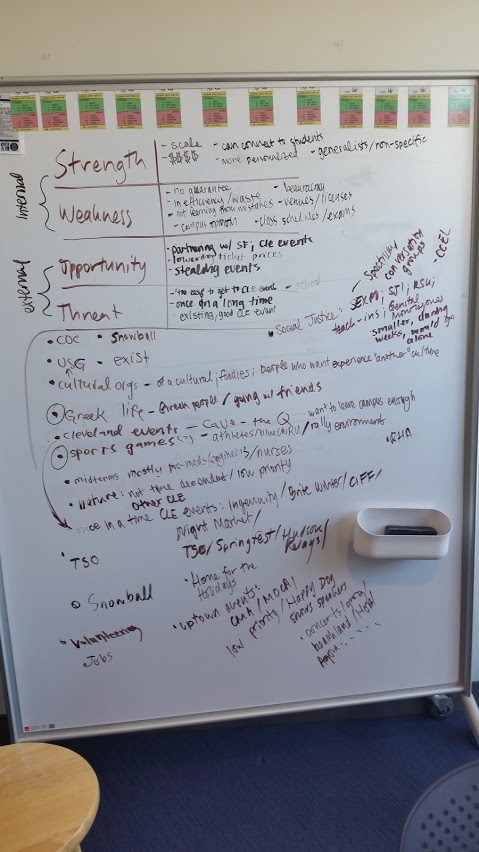
Our SWOT analysis.
We began by running a SWOT (Strengths, Weaknesses, Opportunities, and Threats) analysis to get a better sense of the event programming landscape on our campus.
.png)
.png)
.png)
.png)
.png)
.png)
.png)
.png)
.png)
.png)
We spent some time coming up words that did or did not describe UPB, which we then sorted into who we are, who were aren’t, and who we want to be. Based on those words, we created statements about UPB using the format “we are […] but we aren’t [..].” Then, we ranked ourselves compared to brands like Hallmark and Levi’s for sincerity and ruggedness. We considered UPBeats, our concert series, an outlier.
Those statements and ranking would help us come up with a single-sentence statement based around the general groups we created. By the end of the meeting, promo members had a better sense of our brand.
.png)
These statements let us concisely describe the “feel” of UPB, as well as keeping us unified in our decisions. For example, multiple people from promotions would respond to messages on Facebook, or create posts. With this workshop, we were able to be more consistent in our language. After the meeting, I created a slide deck (seen above) to share with the rest of the board.
Fall Giveaway
Traditionally, in the fall, the University Programming Board (UPB) gives out free t shirts to the student body. In previous years, we had seen that students really like the long sleeves we give out!
I wanted to incorporate a lightweight survey into this giveaway. Instead of giving the shirts away for free, we could receive data to understand what kind of people come to our events. Previously, other committees had sent out relatively long surveys to people who had participated in events. Longform feedback of this sort was helpful, but I did not think this was the right format for this event. Instead of offering up gift cards, we could offer up our shirts. I limited the survey to one question, hoping that less work meant better results. Since we were the promotions committee, we wanted to know what channel of promotion to target! The survey took the form of a business card-sized slip of paper with radio buttons that asked, “How did you find out about this event?”. I designed them in this way so that it was minimal cost to distribute during an event. Students could hand over the slip, and the committee sorted the data afterwards.
The shirt we gave away was trendy: maroon and minimal. I created the sun and cloud design to reference CWRU’s weather, as well as our school song. Shine on forever, Case Western Reserve.
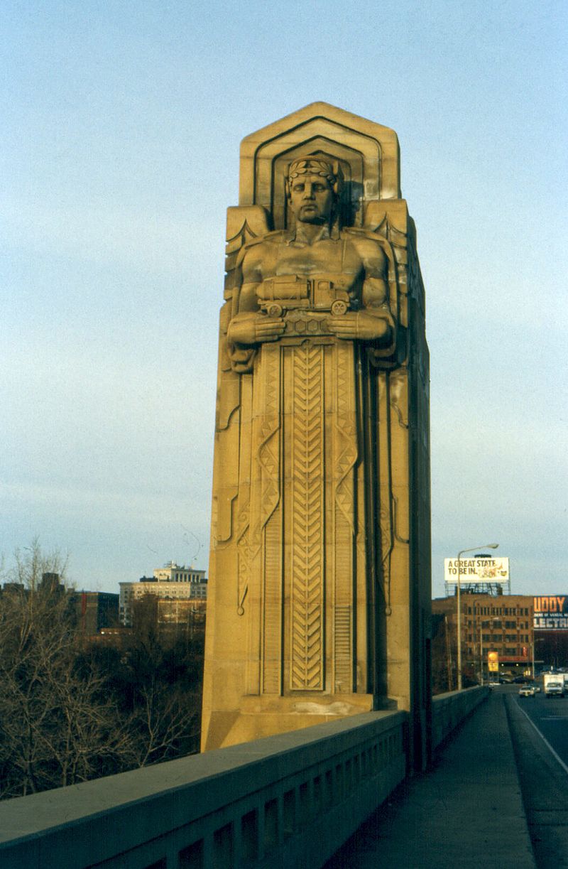
Personally, I felt that it was important to showcase CWRU’s location in Cleveland. Giveaways from last year referenced our skyline. I really wanted to use the Cleveland guardians, a set of statues that adorn the Hope Memorial Bridge. These stone figures stand watching anyone who drives over the Cuyahoga River. However, after asking several students for input, I learned that no one actually knew who they were. Cleveland’s cloudy weather was found to be more relatable.
I wanted to simplify the giveaway process in our organization. We usually gave out shirts directly from the boxes shipped from the vendors. Rifling around in a box not only seemed unprofessional, but also slowed down the process. We took inspiration from, CLE Clothing Co, a local apparel company, I decided that we should roll each shirt ahead of time with a size sticker. By spending more time upfront (we offered an extra shirt to anyone who came in to roll shirts), we decreased the time that students spent waiting in line to receive a shirt.
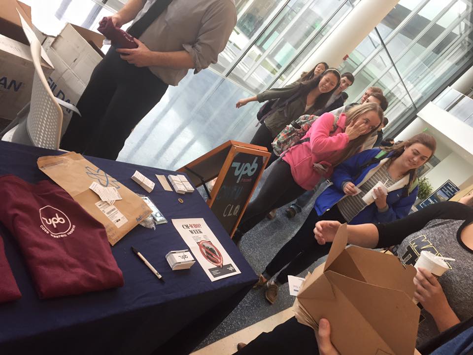
On the day of the event, we gave out surveys to students in line, then collected their responses in exchange for a long sleeve shirt. The process went quickly and we able to gain insights and information about the thought process of the student body. Overwhelmingly, students learned about the event through a friend, as opposed to social media or traditional channels of communication such as social media.
Groutfit Week
Shortly before Homecoming week, I was approached about promoting a survey to the entire student body. The Information Committee wanted to gather information about students during a student spirit week, a week of events intended to generate hype, that would end with our Homecoming rally. While the spirit week was a good idea, other school-sponsored spirit weeks had failed at CWRU. CWRU is a diverse campus, with students from all other the world. As such, many students find their own communities rather than identify with the encompassing community of CWRU.
Putting the students first and celebrating students instead of focusing on the CWRU community as a whole (a bottom-up instead of a top-down approach) might be successful. With so many students, what did they have in common? I brought this question back to my committee. We agreed that a study culture of staying up late and working hard connected the students, but focusing on the negatives (neglecting sleep and overworking) didn’t necessarily sound happy. After a lot of brainstorming, I spun it into a positive.
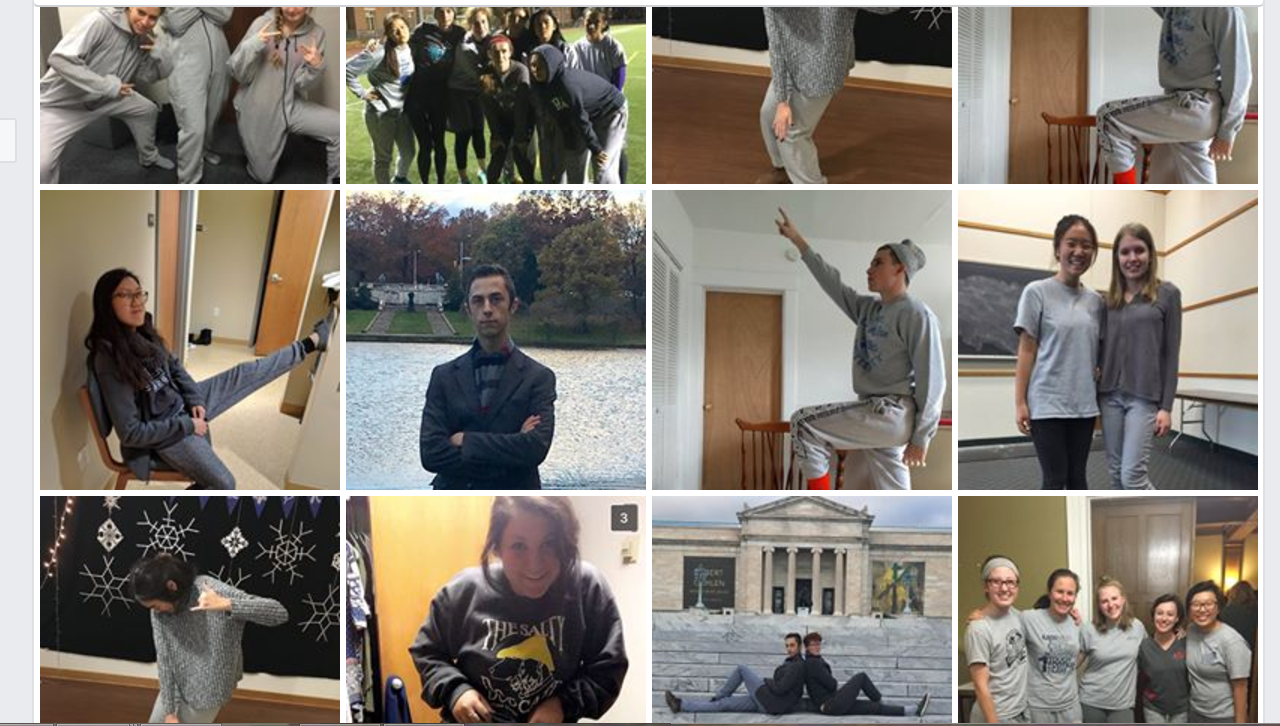
After a particularly draining study session, I realized that my friends and I goofing off in the medical school building was one of the things that kept us friends even during stressful times. During those times, we weren’t afraid to be ourselves, even while wearing pajamas. As such, groutfit week was born.
A groutfit is an all-gray outfit, usually consisting of a sweatshirt and sweatpants. It’s comfortable and cozy, and a gray is a school color. With this spin, we launched our most successful social media campaign yet, asking students to submit their grout fit pictures for gift cards to local coffee shops.
We had many submissions to our groutfit contest.
During this week, we also had a fall giveaway and a gray-out at the Homecoming game, where students were encouraged to wear gray. In order to incentivize the gray, we printed 100 gray shirts with the same design as the fall giveaway shirts and distributed them at the pep rally.
A groutfit selfie with our exclusive gray shirt.
Groutfit week struck a note with students and was frequently discussed. The outfit contest had more participants than any other contest held on the Facebook page and students still wear their Homecoming-exclusive gear around campus.
Homecoming
As part of the hype week leading up to the football game, CWRU hosts a Homecoming dance. Few people on campus are aware that there is a Homecoming dance. As such, our biggest challenge was not competing with other dances, but making students aware of the event. Students at CWRU also prefer to go to events they think their friends will be attending. They also don’t enjoy being the direct subject of promotion; promotion campaigns involving tabling or asking students to engage with promoters do not usually net good results. Tabling, even in heavily trafficked areas, does not generate interest.
How could students be bystanders but still be engaged in learning about the homecoming dance?
I was inspired by a promposal I saw on Twitter. We could fake the hype! The promotions committee asked several popular couples if we could use their names. We then created homecoming proposals on sidewalks, the spirit wall, and on our digital bulletin board. By increasing visibility and recognizing that Homecoming was a one-of-a-kind event, we sold all of the tickets available!
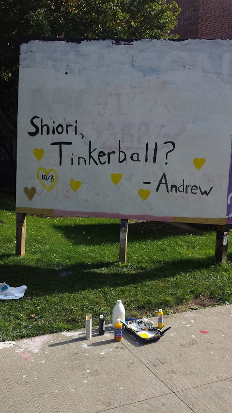
Andrew slept through this painting session, but he heard a lot of compliments about his cute ask.
New Spirit Wall Workflow
There’s a large swatch of plywood outside of our community center called the spirit wall where students can advertise events. If it’s cold–and it often is–painting the wall is anything but fun. In the past, we used paint brushes and step ladders to lay down a base coat the night before, then wrote additional information the next day. This process spanned several hours and because it took so long, we rarely advertised on this highly visible platform.
Good thing I was learning about parallelization in my computer science classes. If we had several people working at a time, we could speed up the rate at which we could paint. Unsurprisingly, forward planning helped. Three people would roll out a background color, then one person would sketch the lettering based on a sketch. As soon as a letter was sketched, someone would follow up and paint the letters.
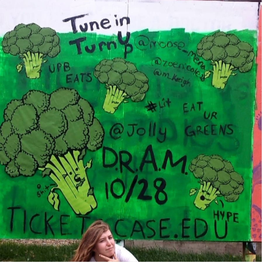
We created this broc-heavy tableau for the D.R.A.M.concert.
We were goofy during the process and took shortcuts to speed the process along, such as printing images that we needed so that we didn’t have to draw a bunch of broccoli by hand, or sloppily render Ned Stark. One time, we stapled a giveaway shirt to the wall and to our dismay, no one stole it.
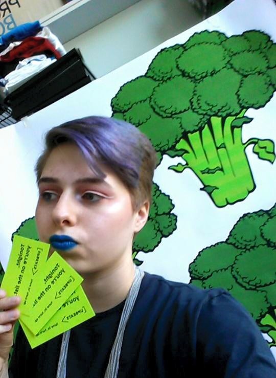
Promotional pictures on my personal account usually featured some behind-the-scenes.
By introducing this new, parallelized process, I was able to reduce the amount of time and perceived effort it took to create a spirit wall advertisement. We were able to offer spirit wall ads to committees as a platform for advertising, which allowed events to be promoted to a large amount of students.
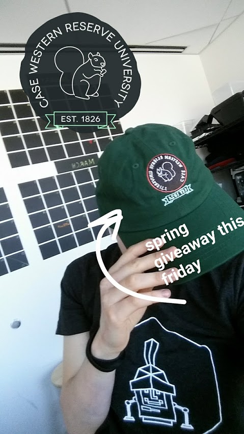
Spring Giveaway
Similar to the fall giveaway, UPB also has a spring giveaway. Last year’s spring giveaway was a minimal black CWRU shirt. This year, I wanted to continue spreading CWRU pride in a way that wasn’t over-the-top navy and gray like most of our school swag.
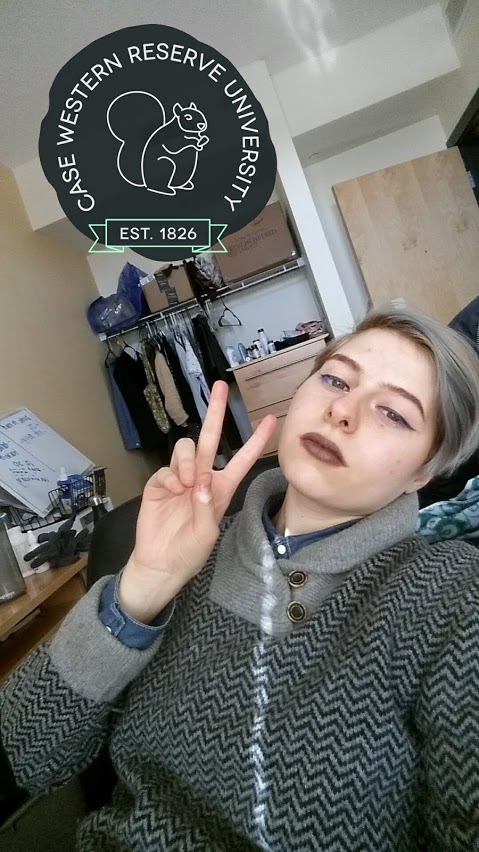
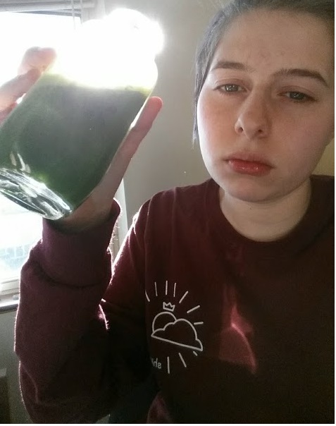
The snapfilter in action.
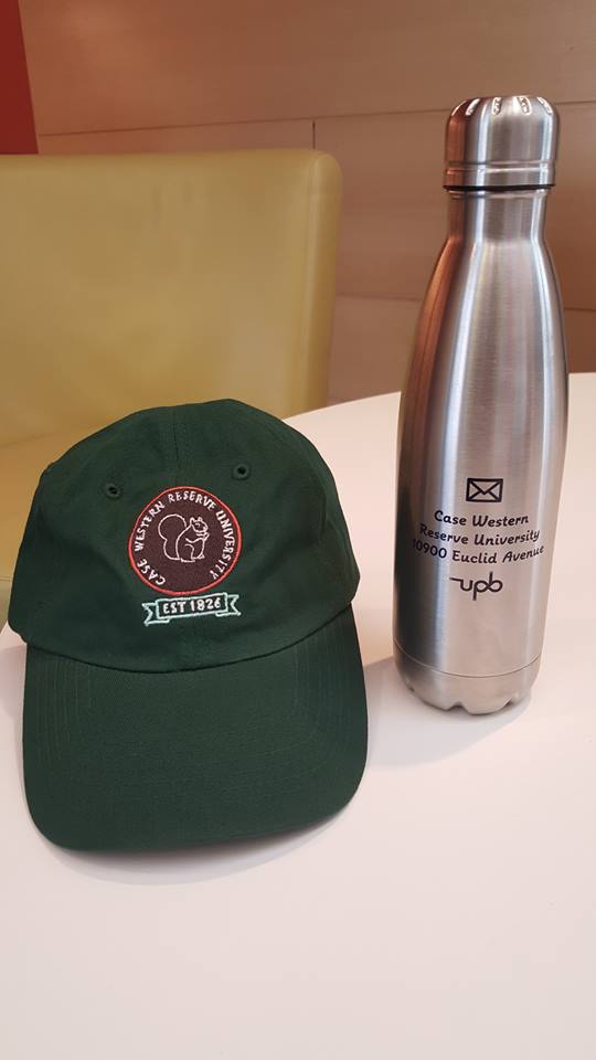
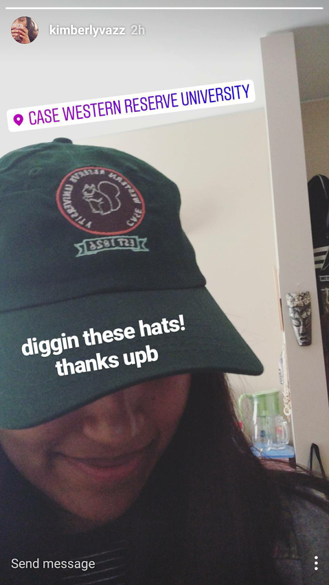
A few weeks before we started planning, I made a Snapchat filter based on some trendy nature-inspired badges I had seen. The filter was popular, and we thought that reusing the design would be a nice way to create a sense of relevance for our giveaway item. The forest green filter featured an illustration of a squirrel, which I had chosen because tons of squirrels roam our campus. They’re cute, they’re small, and they also eat at the campus diner, just like us!
A promotional picture we posted online.
Patch hats (5 panel caps with an embroidered patch) were gaining popularity, so students would probably jump at the chance to get one for free. Our giveaway budget was $10,000 with a short turnaround time; I wanted to make sure that our items would arrive on time and that this money would be spend wisely. A $20 giveaway item(s) that is used once, then thrown out, is a waste of resources (and time). $10,000 could also go a long way to helping pay the bills for a small company.
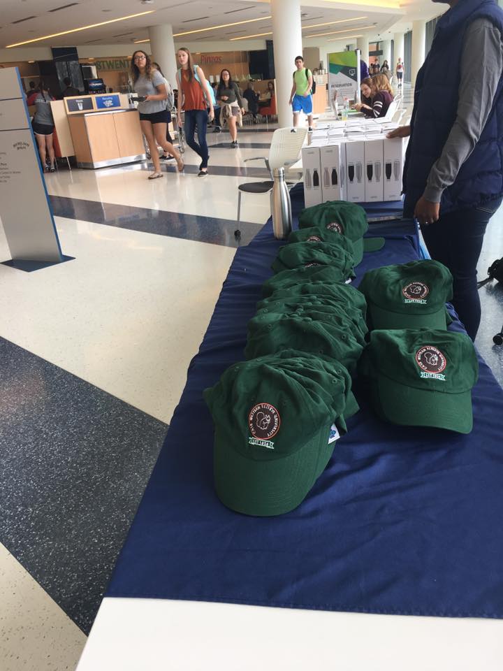
We worked with Apliiq, a smaller-scale streetwear producer, to get the hats. I chose to have our logo embroidered in a matching green color on the back of the cap, as blatant logos often don’t gain traction on our campus. In addition, we gave away force-vacuum water bottles. The sleek, insulated container with minimal design, would encourage people to incorporate it into their lifestyles and not toss after a few uses. The bottle featured a letter icon with the school’s address in a subtle display of school pride.
The week before the event, we promoted the giveaway online. Students turned out in droves, beginning to line up 30 minutes before the event started.
Even though this giveaway was free, as a form of line control and data collection, students had to select their three favorite UPB events from the school year. Once they filled out the form, smiling UPB members handed them a bottle and a cap. By walking through our workflow in advance, as well as expanding into four lines at peak time, we were able to give out all 500 giveaway sets in an hour and 15 minutes – that’s nine seconds per person – in the most organized and calmest giveaway the campus has seen.
Thinking about the environmental and social impact of our giveaway items let me feel good about our event, not just because I was excited to see my work reproduced, but also because these were items students would actually use.
New Workflows
When I created the new structure of the promotions committee, I knew I needed to think through our workflows. Where would people get stuck? What would be difficult to follow?
I ran through the creative workflow once on my own and then tried to fit in a practice round with my team over the summer. To reduce basic questions (so that here could be time for more complex questions and rough drafts), I created thorough documentation of every role. I knew that there would growing pains, so I pushed us to start early on projects and communicate more with other teams. The more the other committees knew about what we were doing, the easier it would be to work together. At general body meetings, I would talk about what the new promo request form was and how to use it.
Every month, or after an event that highlighted a flaw in the process, the team and I would recap and adjust the workflow if needed. At the second semester mark, I decided to expand the committee. We had a large applicant pool and it would reduce the workload of each person, letting them spend more time developing ideas.
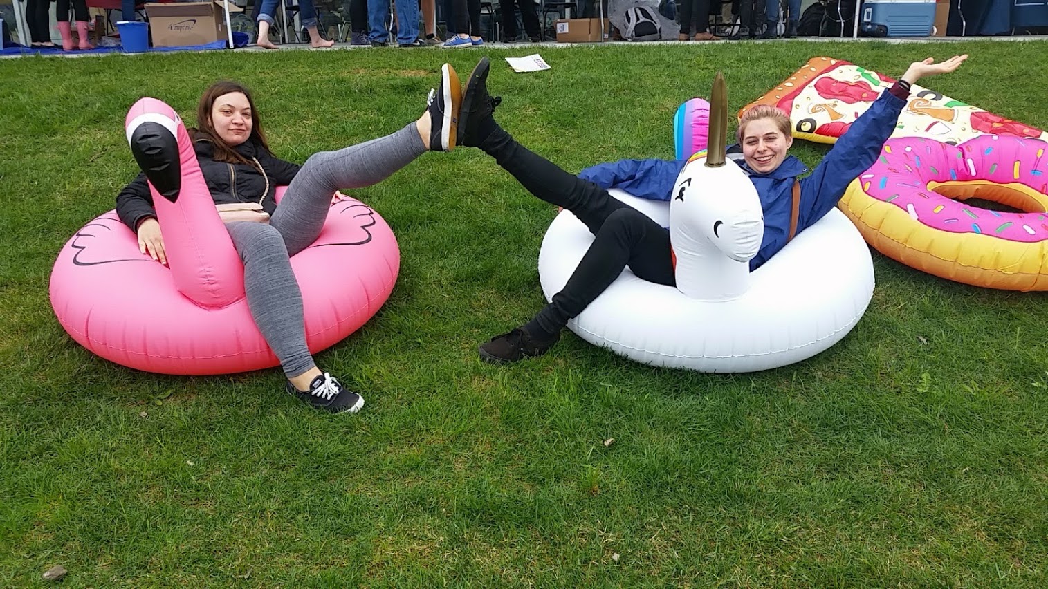
One of our ideas was a pool floatie VIP lounge.
Throughout the year, our main issues were: not enough lead time (last minute promo requests), miscommunication between teams, and confusion on roles.
A slide from the end-of-year recap.
Our end-of-year recap helped us understand gaps in the process and where we can improve for next year. This year, we reduced paper waste from unused flyers that were never hung up due to time constraints and our giveaway items were appealing and useful to students. The documented workflows helped lead to effective and consistent distribution of promotion materials across all our channels with a minimal amount of time spent onboarding.