ICU Information Design
A pressing issue facing many Intensive Care Units (ICUs) is the vast amount of data contained in the electronic medical record (EMR), which holds too much information for a medical professional to analyze. For my final presentation, I focused on introducing the expertise of a human to the mass of data in the EMR so that they can filter and summarize information in order to improve accessibility to care providers during rounds.
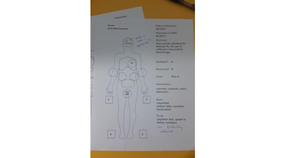
A blank version of my solution.
My proposed solution was a high-level summary of key vitals in the EMR that can be printed for use as a structured note taking system during rounds and viewed as a table of contents for the printed EMR during and after rounds.
MIDS 440
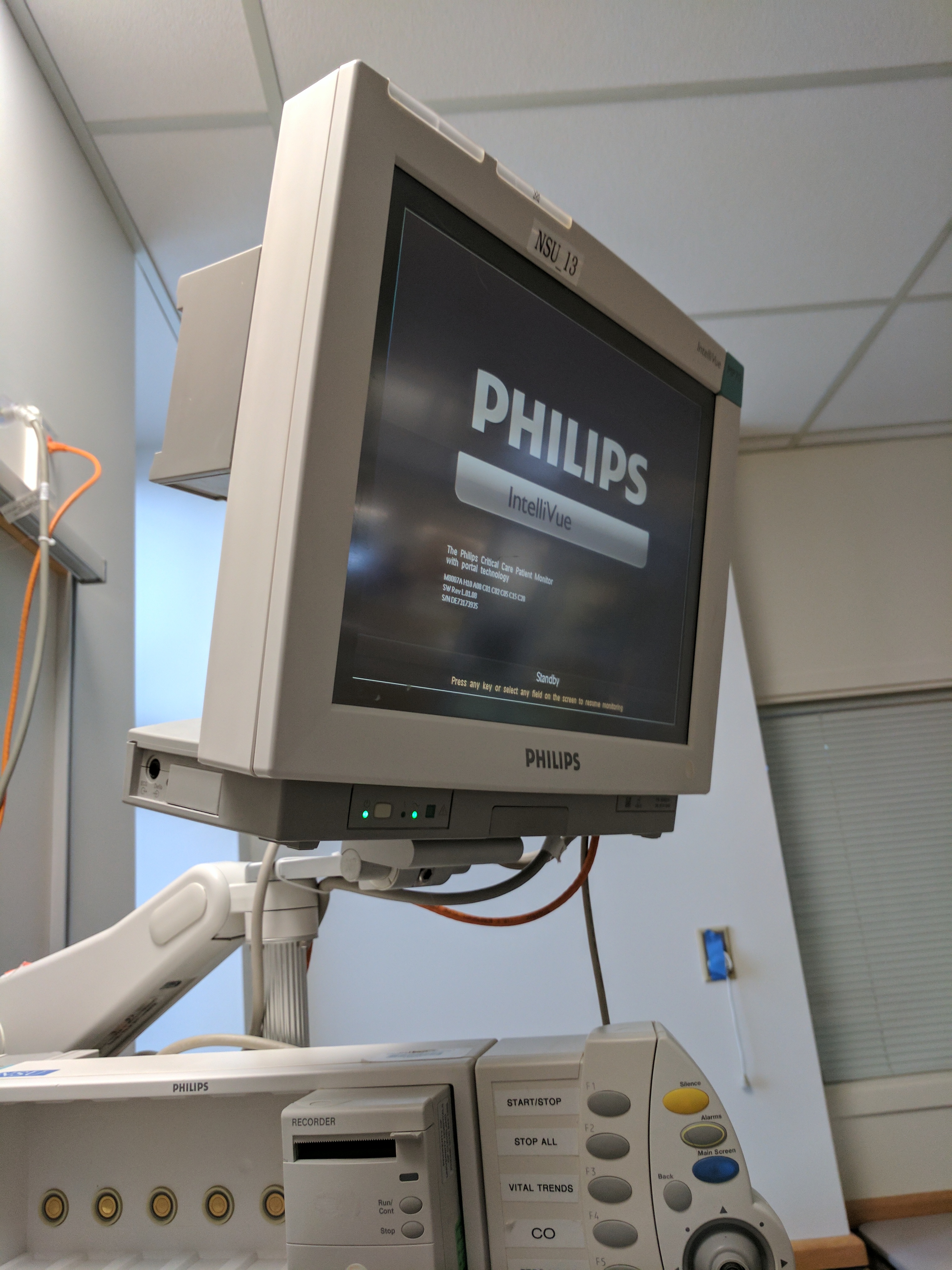
This spring, I enrolled in an elective from the MBA program, MIDS 440, since I wanted to better understand product design. I had previously been interested in the topic and this class quickly became my favorite as I learned more. Throughout the semester, we worked with Dr. DeGeorgia from the Neuro Surgical Unit at University Hospital (NSU at UH). Dr. DeGeorgia had previously authored an article on the data that is obtained and displayed by monitors and equipment in the ICU. He found that one of the issues facing the people who work with patients is that waveforms and data are not recorded, leaving providers without a way to analyze trends over time.
As a pilot study, we didn’t expect to create many prototypes, but rather, gather information for future classes to explore. For my final project, I not only worked with my team on a star-shaped visualization, but also refined a diagram on my own.
Initial Research
I started out on the process team, and we spent several weeks researching the career of a patient in an ICU. We learned about flow sheets and the different articles that doctors and nurses use to record information. We learned about who enters information into the EMR and what kind of information is produced. Nurses are information bearers, moving information from monitors and patients to records and doctors.
Continued Research
The process team then became the visualizations team. We went through two rounds of research, observation and several rounds of ideation. In the meantime, we interviewed with Dr. DeGeorgia. It took us a long time to understand the problem we were facing. As we searched for the problem, we continued to learn about existing visualizations in the ICU.
First Prototypes
One of the silliest ideas I presented was the prize wheel: A spinner wheel with different organ systems to mix up the order in which the team presented.
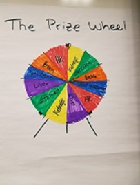
Based on a prize wheel that UPB used.
I also presented a tactile information display system named the sandbox. The tactile portion was discarded, but the star visualization turned out to be an idea previously explored in the context of ICU information display, and my team continued on with it.
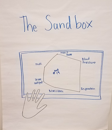
Found while researching visualizations in the ICU.
The visual I focused on for the last part of the class grew out of the observations we did. This display focused on bridging the gap between the current EMR and the current way rounds were done.
Observation
The opportunity that really shaped my prototype was the day we shadowed the NSU. A teammate and I followed a team on their morning rounds as they interacted with the different patients in the ICU.
While shadowing, there were some things that I didn’t expect. Every resident had a printout of the EMR, which they referred to almost as often as the electronic version. Nurses wrote on blank sheets of paper and residents scrawled notes on their printouts of the EMRs. One resident drew a stick figure to record where the patient responded to stimuli.
Surprisingly, each member of the team also referred to a printed Excel spreadsheet. Patients were summarized in rows since the EMR was “too big to see all at once.” As the residents go bed to bed, the attending checks off each patient on his copy. The residents follow a diagnosis, assessment, plan (DAP) structure for their summaries. They will talk about systems in the body if they are of note, but not mention those that haven’t changed.
Insights
Observation was illuminating. A human is needed to summarize the vast amount of data in the EMR. A lack of hierarchy and scannability makes it hard for people to understand what’s available. We saw that the transition to digital isn’t seamless - people still use paper because it works on their terms.
Combined with our prior research on representations and discussions about filtering, an idea began to take shape.
Solution
The solution I presented was a summary sheet derived from the EMR. Data would be selected from EMR during entry or review to be seen on the summary sheet later. This would augment or supercede the printout that is generated by hand. Its layout encourages diagnosis, action, plan note-taking. It would deal with the present through future aspects of rounds as it allows for diagnosis on the left hand side, the assessment and planning on the right hand side. Potentially, future iterations could contain fewer or more categories - the current categories are pulled from the hand-created sheet.
What the summary sheet might look like in the EMR.
This sheet would lessen the number of intermediate steps that have formed as a workaround for the EMR. It can be edited while digital, then printed and used as a table of contents for the EMR during rounds. This new format allows specific vitals to stand out, lending importance to factors that the current spreadsheet lacks.
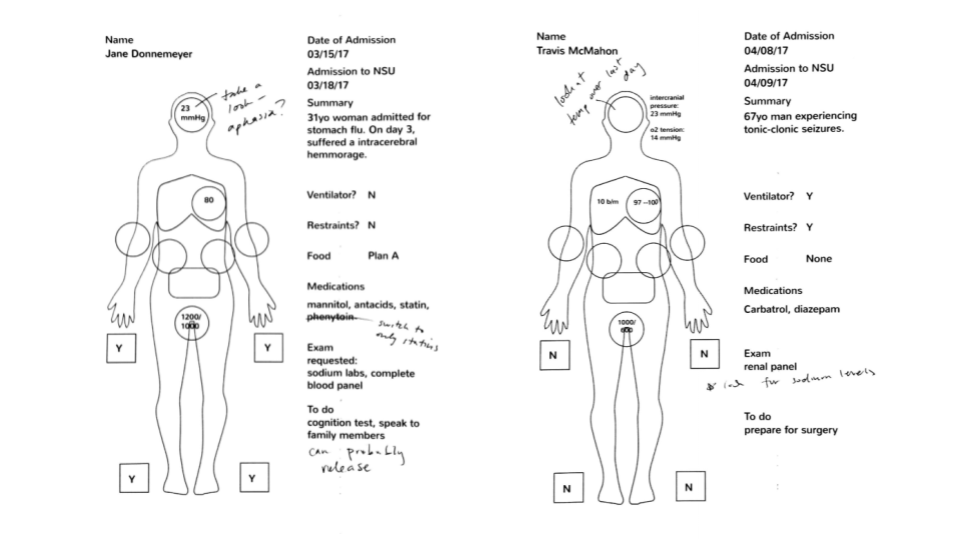
Scenarios that we encountered while shadowing were used to populate the sheets.
Integrating the worksheet into existing workflows would be minimal, as EMR integration reduces the time spent transferring information.
Room for Improvement
Due to the scope of this class, we weren’t able to conduct any user testing. Stylistic changes to preserve integrity while photocopying, for example, or to improve ease of use would be discovered through a review. Additionally, the technical aspect of creating an interface like this in the EMR would have to be addressed.
Final Thoughts
I’m so glad to have taken this class! Being able to observe and research a problem in the hospital was an amazing opportunity. It was challenging to be in an MBA class, surrounded by master’s students, but I pushed myself and really enjoyed it.
Links
A review of my observations and how they affected the final product can be found in our process book.
Thank you to Erin Camia for proof reading!