Sexual Assault Awareness Posters
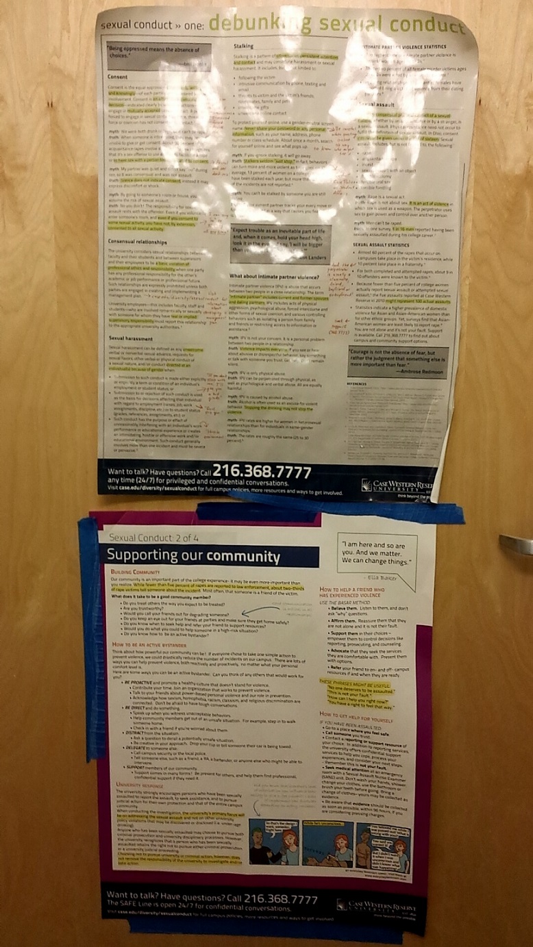
Case Western Reserve University has something unique about its bathroom stalls: on the back on every one hangs a poster about sexual assault awareness, punctuated by commentary and comics.
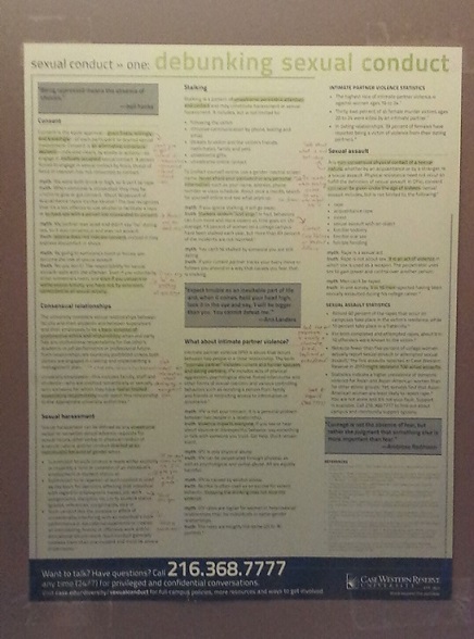
In the spring, I attended a focus group on the bathroom posters hosted by SAVE (Sexual Assault and Violence Educators). Even though the posters themselves had been created less than four years ago, both the content and the style of the posters looked way older. A few points that came up in discussion included the lack of LGBTQ resources, outdated online information, and general unattractiveness. (Ok, maybe those were some points I brought up…)
At work, I mentioned to my supervisor that I had attended, and she responded surprisingly: “Do you want to redesign them?” (Yes. Yes, I really wanted to.)
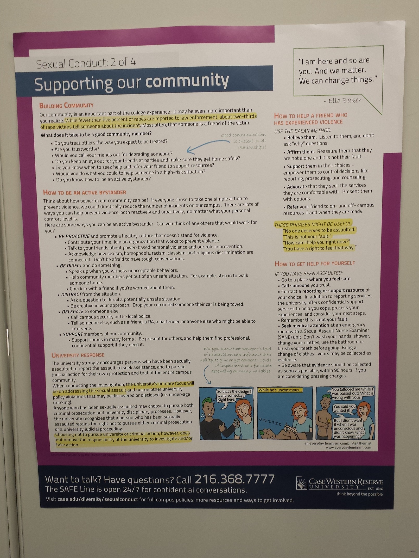
We’d be expanding the series to four posters instead of three, and I set out to tackle the things that irked me the most. The gray background, drab color scheme, and awkward speech bubbles had to go.
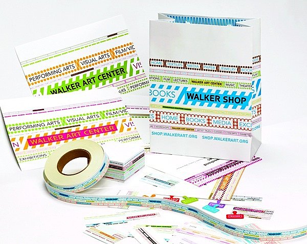
Inspired by the Walker Art Center redesign, I tried to bring our school-standard font, Titillium into a brighter context by using it in all-caps for the quotes.
A white background would increase legibility, while a colorful open frame not only drew attention to the content, but also carried over a branding component. Some quotes were framed and some were in caps. In the focus groups, people asked for more images and figures.
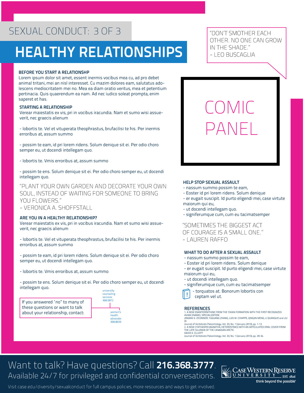
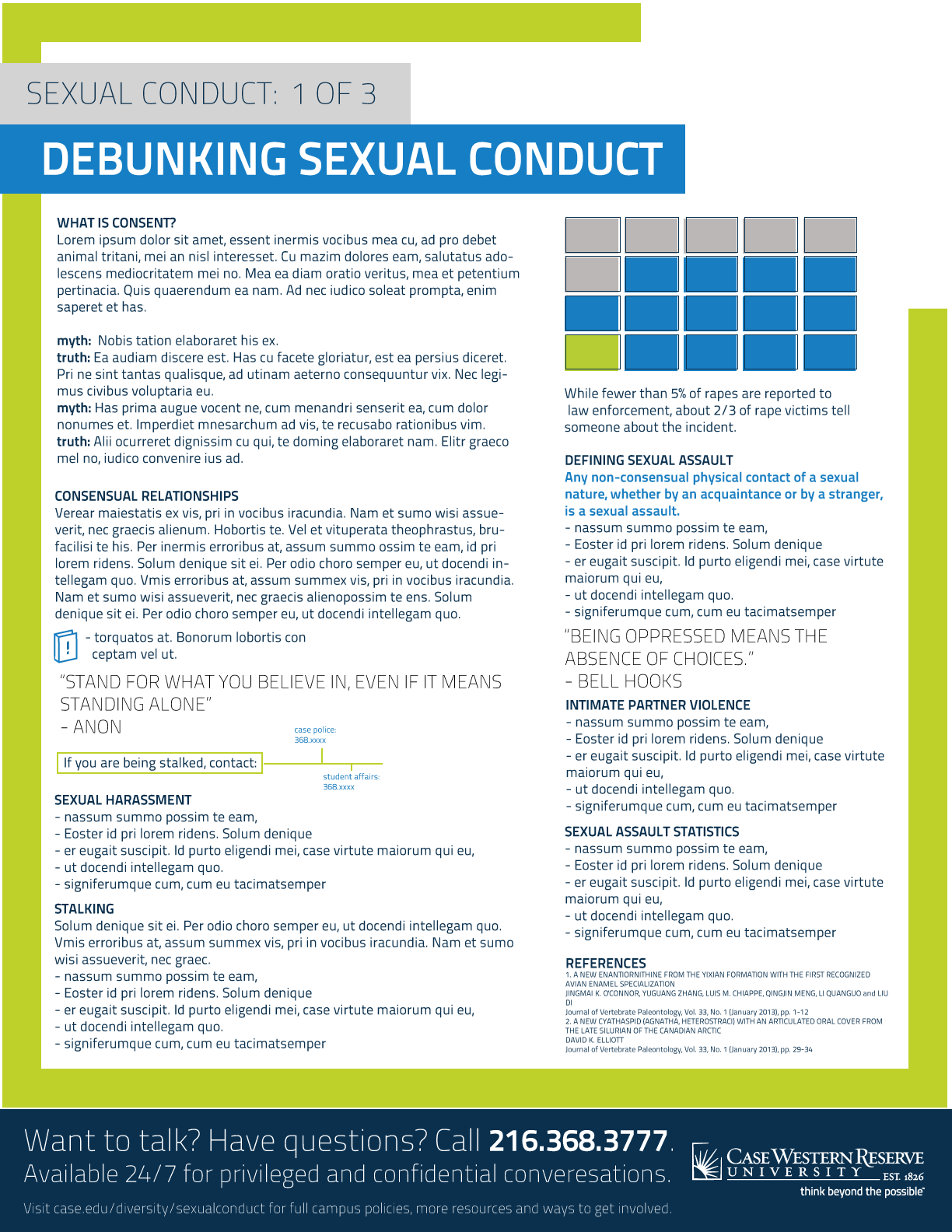
I experimented with adding a book and exclamation icon for further readings or contact information.
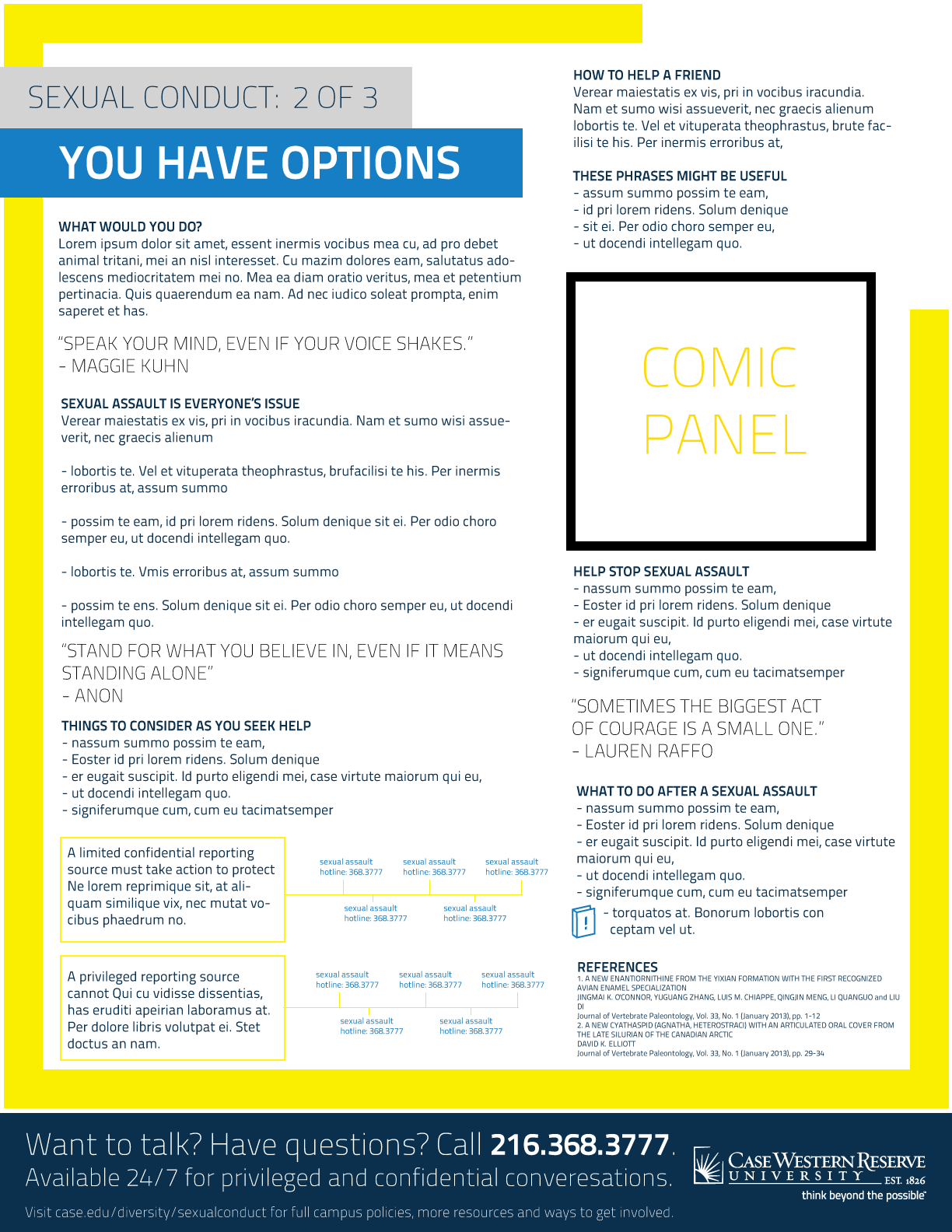
We decided to leave the footer of the posters as is. It worked pretty well, and allowed the new posters to fit in with the old ones.
As of this year, the new posters have been hung in over 2,000 bathroom stalls on campus.
Once I started the template, it was handed off to another team who would write all the information. While the final versions of the posters involved some changes to fit the content, they still look fantastic! I’m so glad I was given the oppurtunity to help create this series of social awareness posters.
I’m hoping to snap a few more pictures of these posters, especially to showcase all four colors of the new ones.