DFA Design Day 2016 and DFA Shirts
Design for America (DFA) utilizes Capital-D Design to solve issues in our community. For our final exposition, I whipped together some graphic design.
DFA is an student organization involved in creating social impact. Throughout the semester, students scope out a problem space and work with a partner in the community to help solve an issue that they are facing. At the mid-semester mark, we hold an Open Studio for DFA groups to receive feedback from faculty and anyone who wishes to stop by. Similarly, we celebrate and display progress on everyone’s projects at the end of the year. For our expo this year, the planning committee and I decided to encourage Case Western Reserve University (CWRU) students to share their passions. We wanted people to show off what they worked on outside of school, and encourage students and members of the Cleveland community to connect with each other and potentially further their projects.
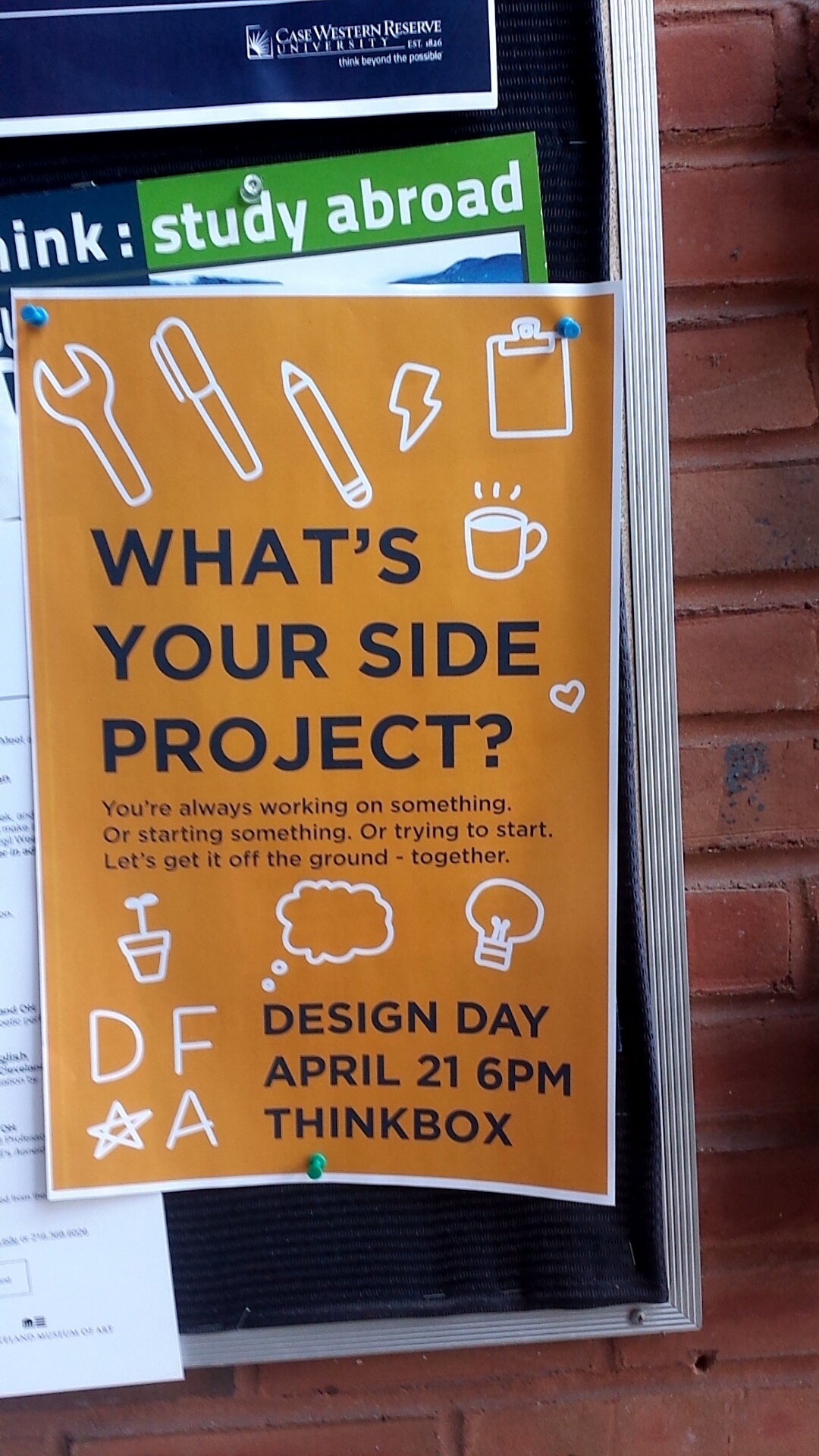
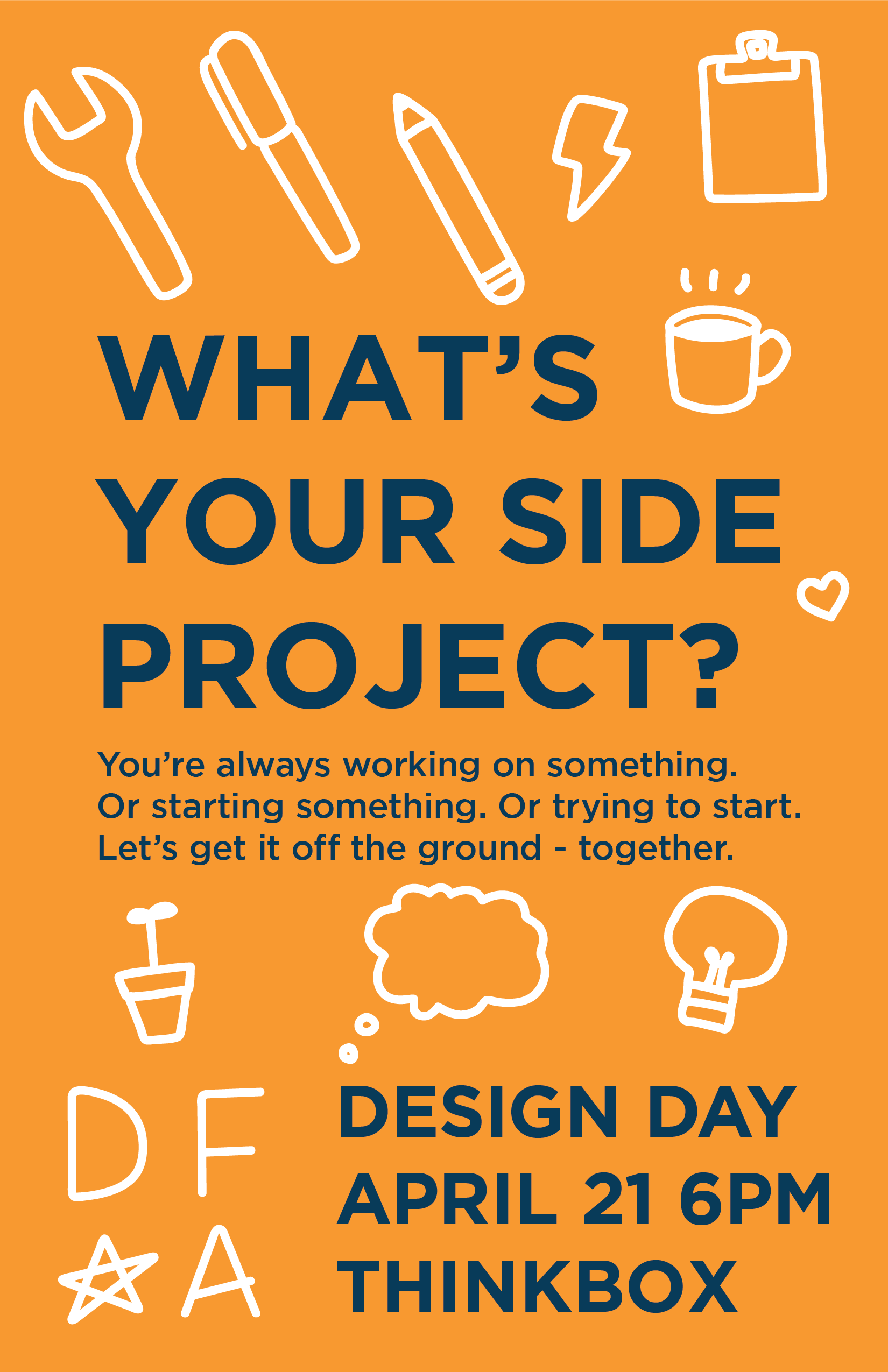
A flyer in its natural habitat.
Right off the bat, we knew we wanted a big installation piece. Like most big pieces, it got left to the very end (and could use a little refinement for next year), but it definitely garnered attention! I’d love to create something similar next year.
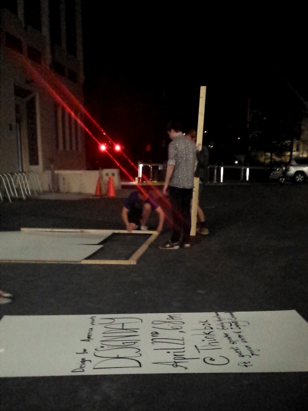
DFA members hard at work, with a test run in the forefront.
After I wrote all the relevant information on the board, they stuck it on the quad, where students filled the boards with their passions.
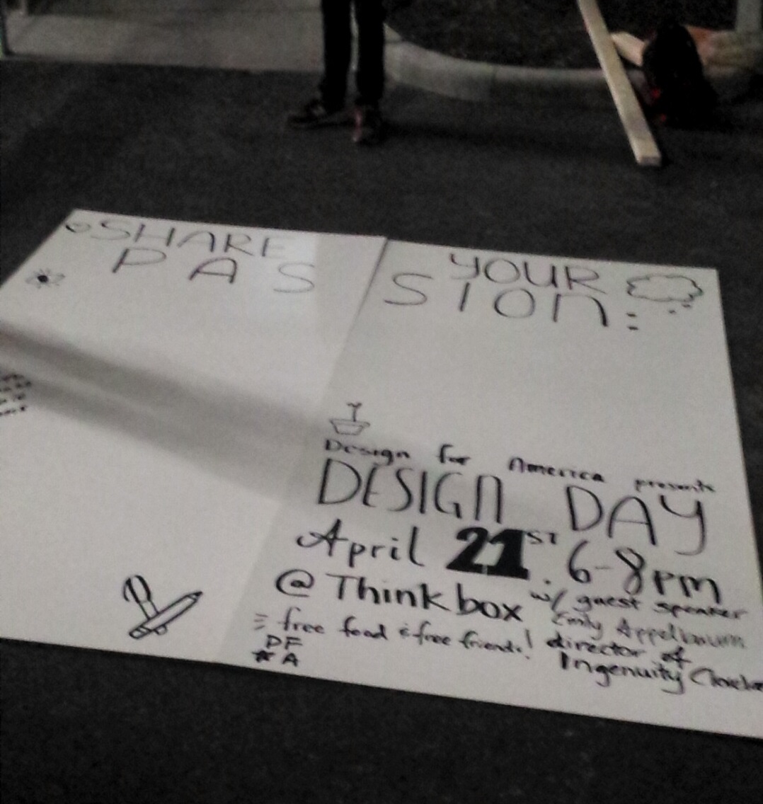
We got the date wrong at first. We fixed it up, no worries.
To unite the board and the promotional materials, I created an icon set with the DFA toolbox.
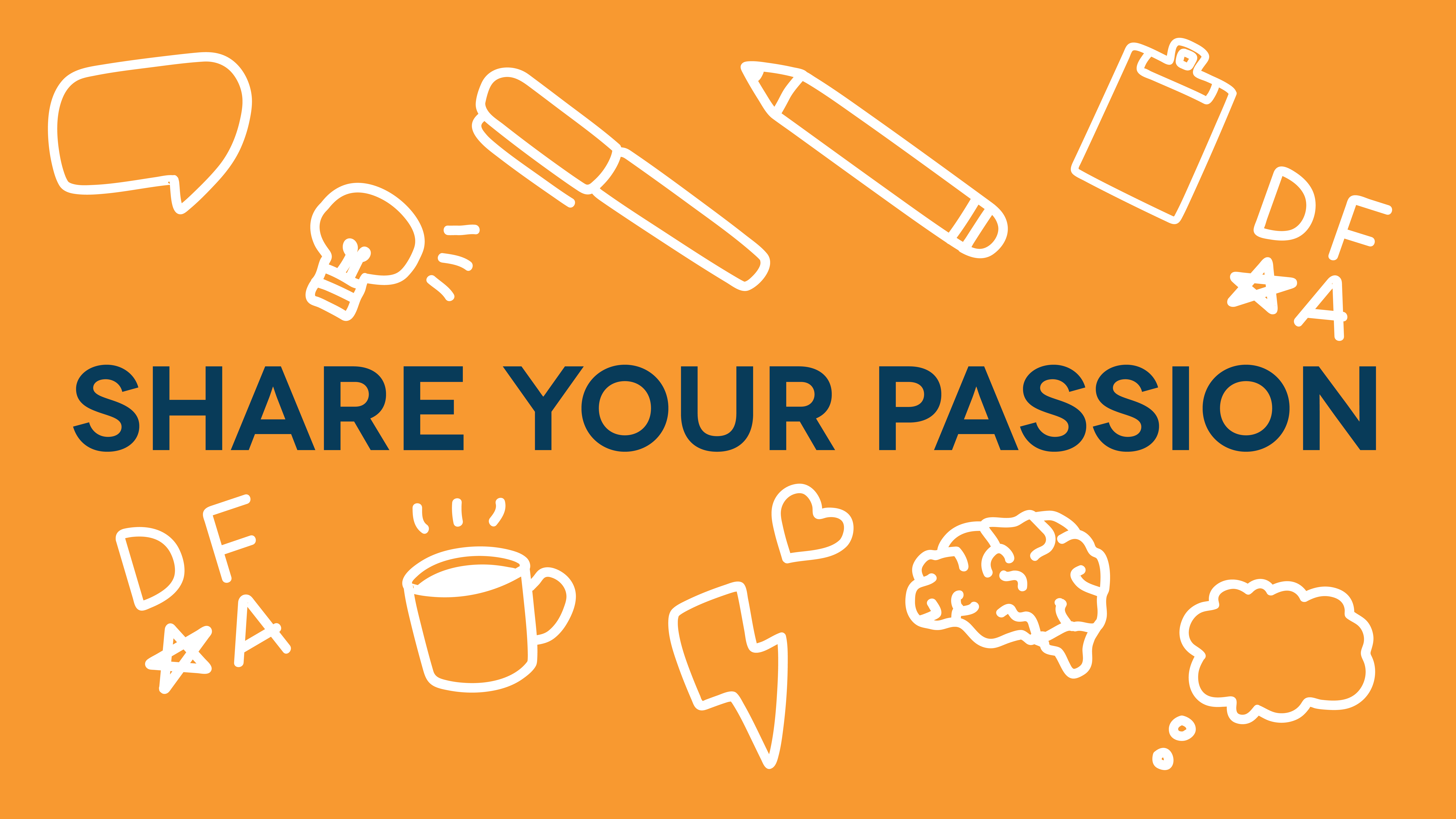
I had dreaming up a single-weight icon set t-shirt design ever since I made my last illustration and had doodled something already. I vectored the icons for use on the flyer, but also drew them on the board. Orange and blue are our studio’s colors, which I incorporated in Facebook posts and the flyers we printed.
The images on the web.
After the event, I pulled together all the icons to create a DFA shirt, mostly because I really liked how the icons had turned out. We ultimately settled on teal with white printing, but then I realized. Our local printer has glow inks for an affordable rate. No questions here, we were going to get glowing shirts.
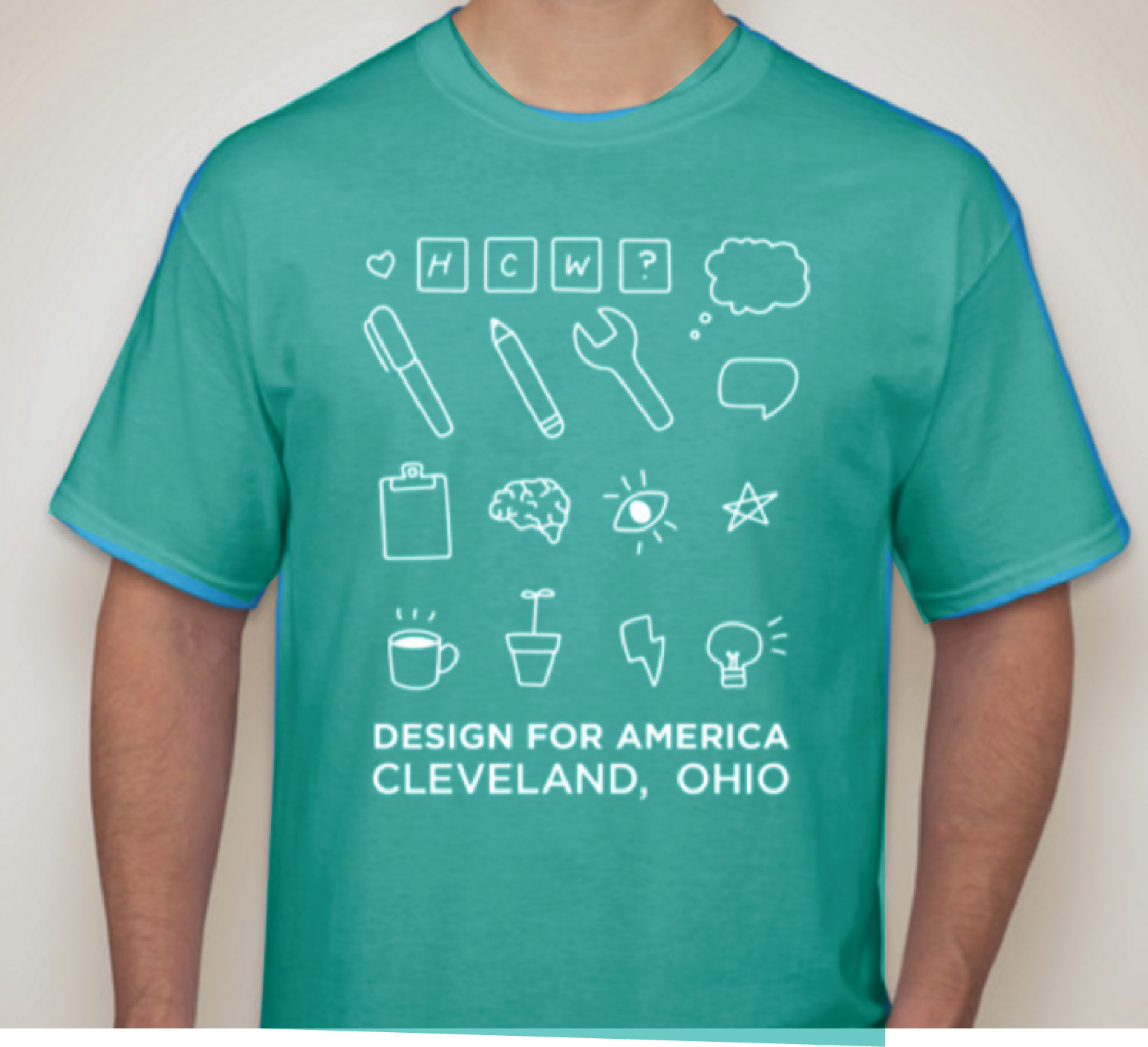
I mocked up how the shirts would look for ordering purposes.
I’m looking forward to seeing studio members wear these shirts when we return in the fall. I’d also like to dive deeper into creating icon sets!
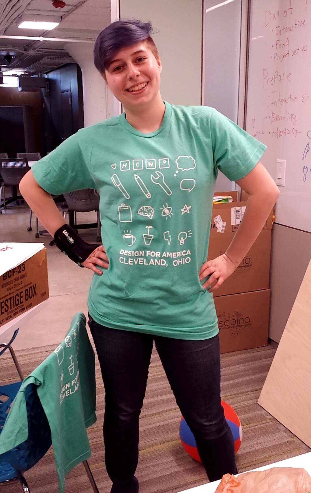
I had to try it on right after we opened the box.