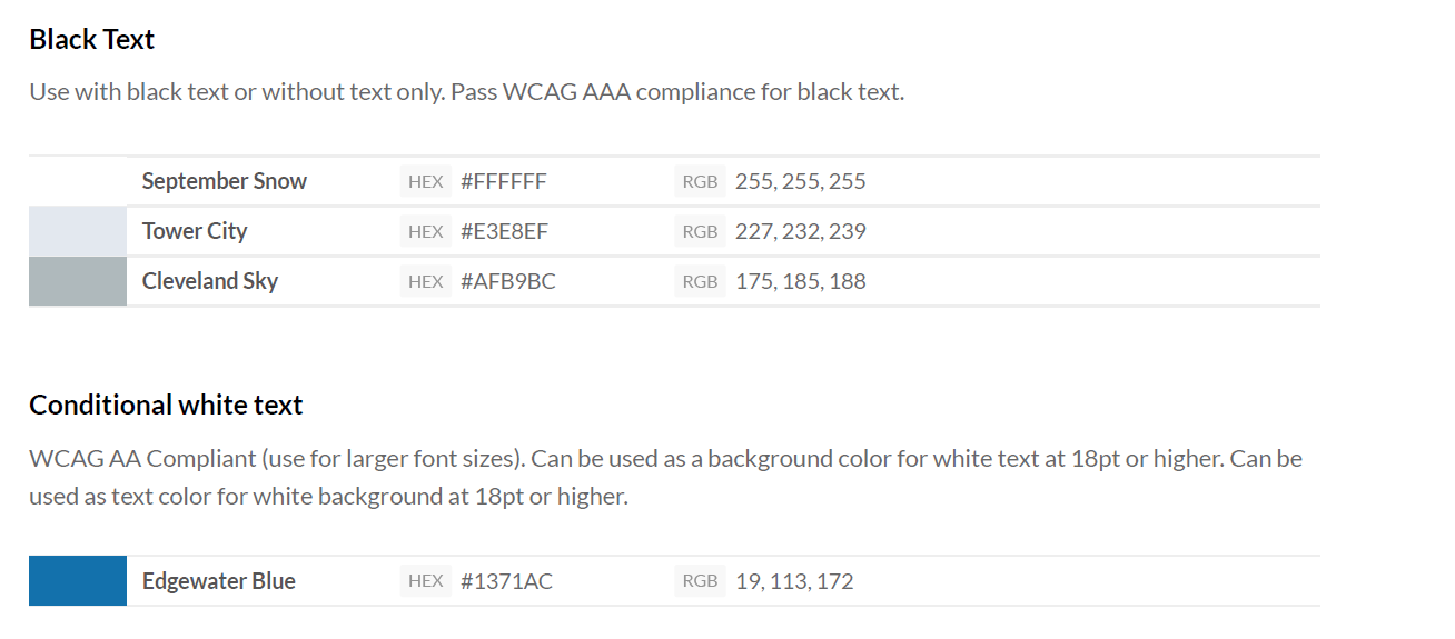
HackCWRU Style Guide
“Yidi, I have one hour a week to help HackCWRU. Where do I start?”
HackCWRU, CWRU’s annual hackathon didn’t seem to have a lot of promotion on campus, but after hearing my brother talk about planning HackIllinois, I was interested and reached out to Yidi Huang, the lead organizer.
At first, I volunteered to lead the marketing and design aspects of our school hackathon. By the end, I ended up contributing to event planning and leading a workshop on front-end development during the event. I created a design system and templates in order to simplify the promotional process for next year’s hackathon.
When I joined, I realized we had no existing resources and pretty much no other people in a similar role. I was able to work with Lucia, another designer, until she suffered a concussion and had to step down. Documents from previous years were hard to come by, and any file we did have were uneditable.
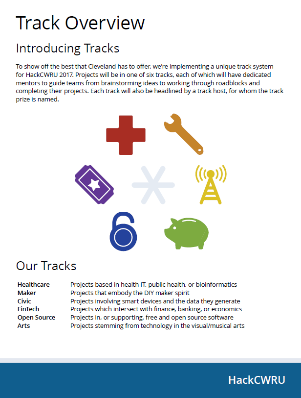
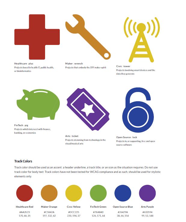
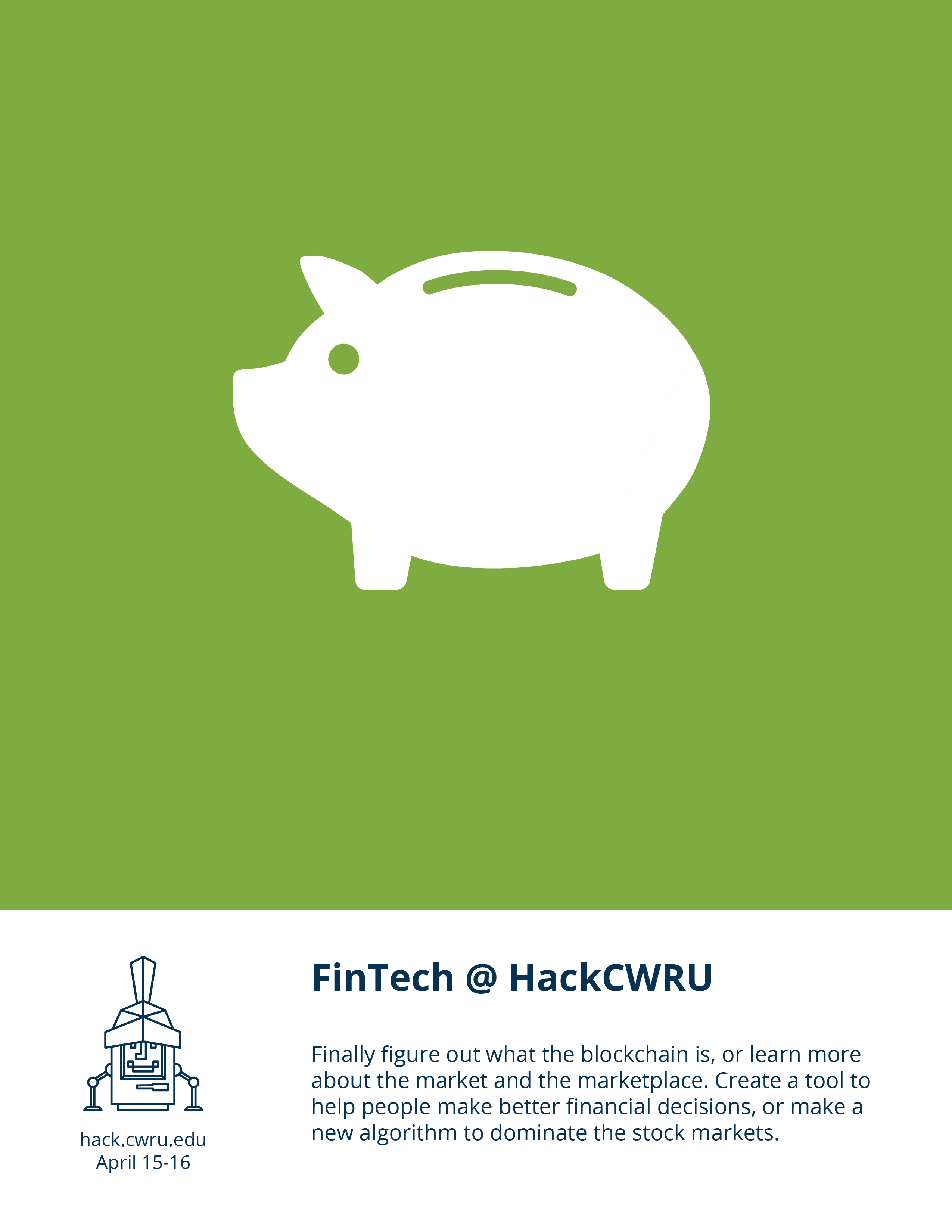
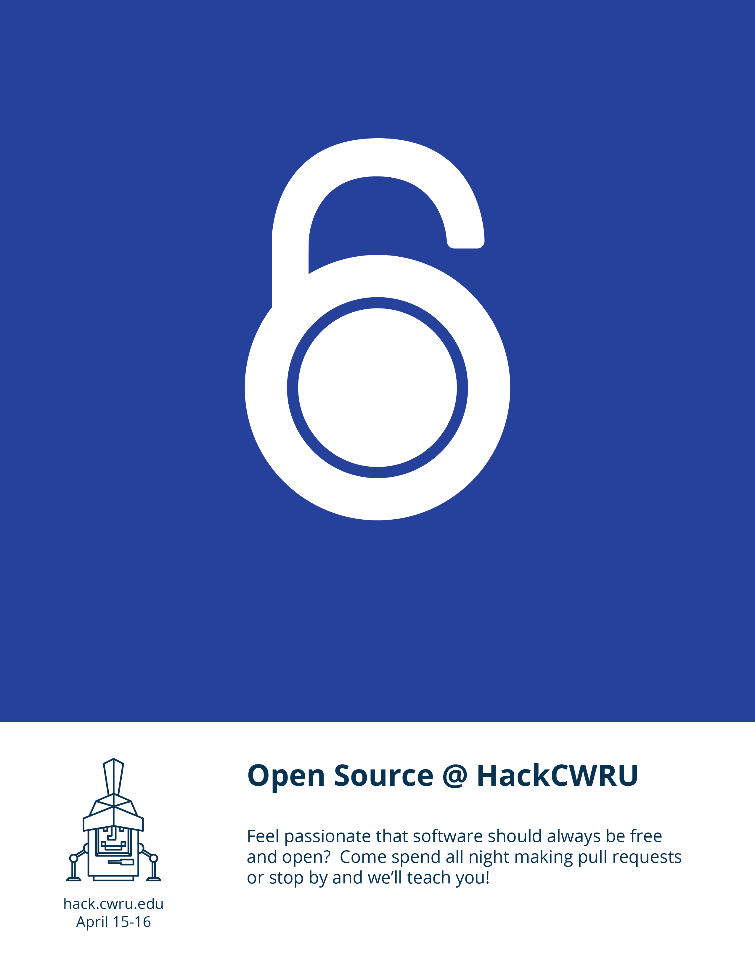
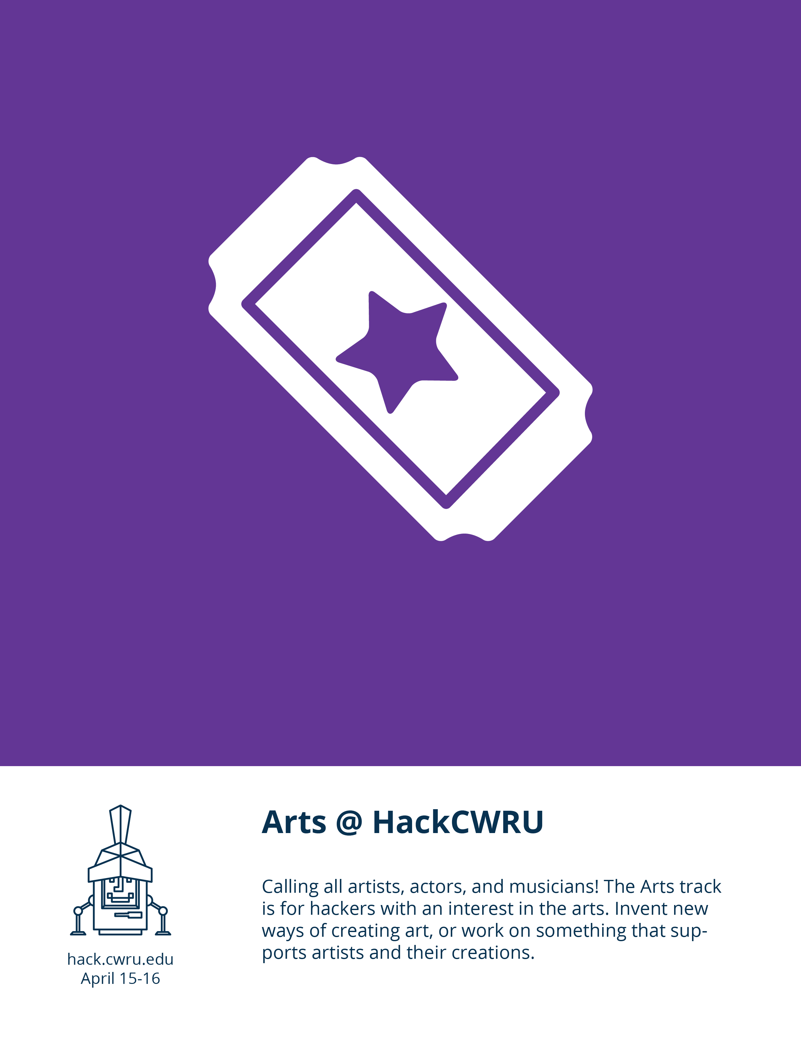
A page from our new sponsorship document describing our track system.
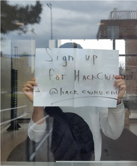
It would be up to me to define the promotions for our 200+ student hackathon. After taking a look at the situation, I limited the scope of the work – we didn’t need to have custom wristbands and event setup if we didn’t even have posters to hang around the school. I also delegated non-creative work when I could. If people who didn’t want to pick typefaces wanted to hang up the posters for me, well, why stop them?
A lot of this onboarding work mimicked the work I had done earlier in the year as promotions director, so I reused materials where I could. I passed along the guide I had written for our social media plan, as well as our marketing plan. By doing so, I acted as a consultant and HackCWRU was able to pick and choose what they thought would be needed. Since my time commitment was variable, I went to meetings when I could and uploaded all of my work when I could. If schoolwork came up, at least the other organizers would have something to work from.
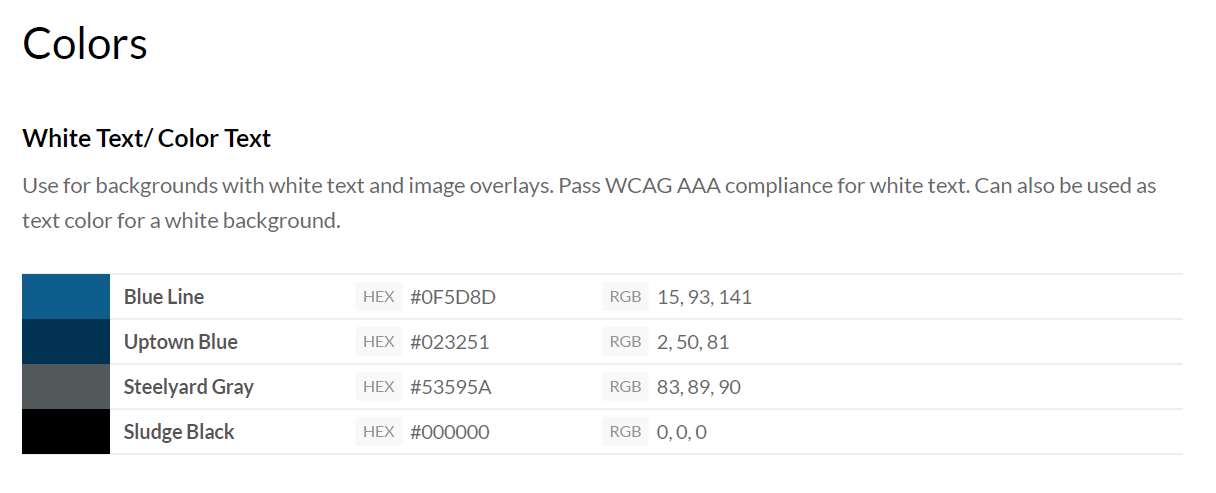
A page from our style guide.
I also created a style guide and led a few workshops on design. That way, people had something to refer to and could solve some problems on their own. The style guide offered sample color combinations that would work for digital to avoid situation with low-contrast text. These colors could also be used in print work. Consistent colors and templates would help unify posters being made by different students.
Once I created templates and basic usage guides, I could avoid answering simple questions and it allowed for flexibility when needing to create something in a rush. For example, our t-shirts ordering was relatively simple: I briefed our lead on how to work with a shirt vendor, and he was able to send over assets as needed to get them printed.
I taught as much as I could about design and event planning to the people I worked with. My experience working with administration was useful when it came to printing and logistics. I worked with other organizers to include them in brainstorms, one of which led to our tracks.
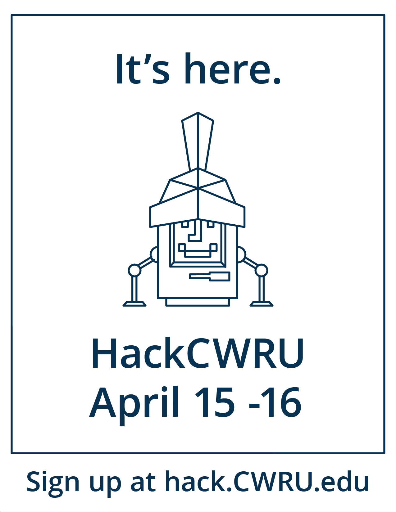
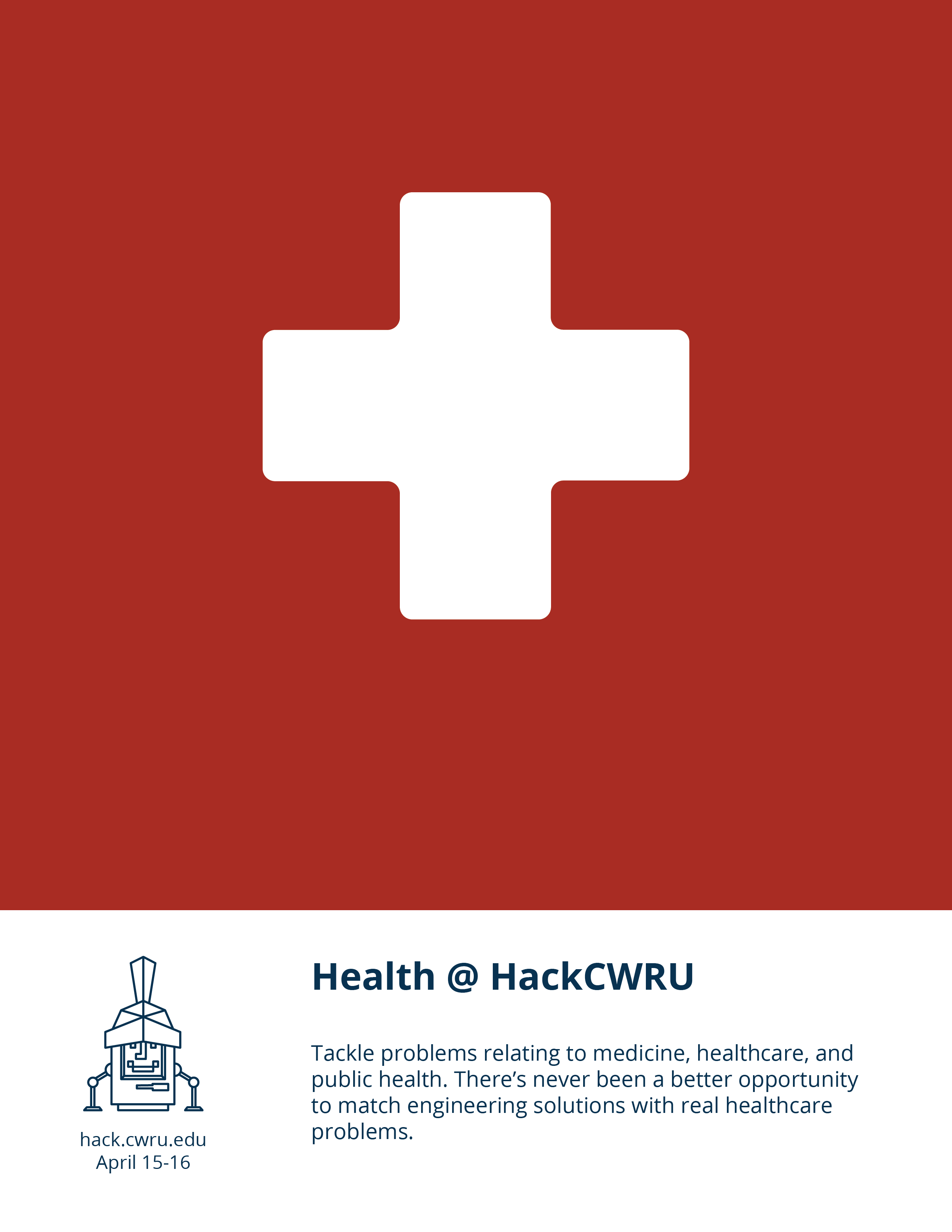
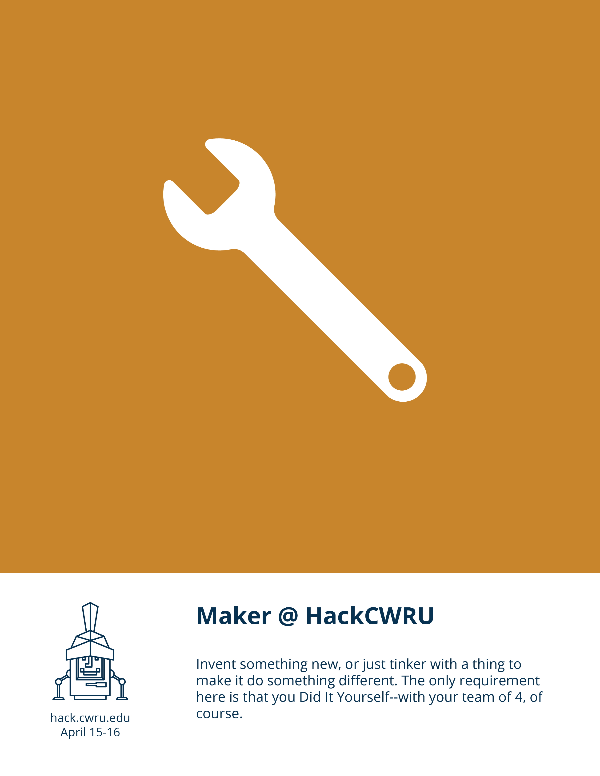
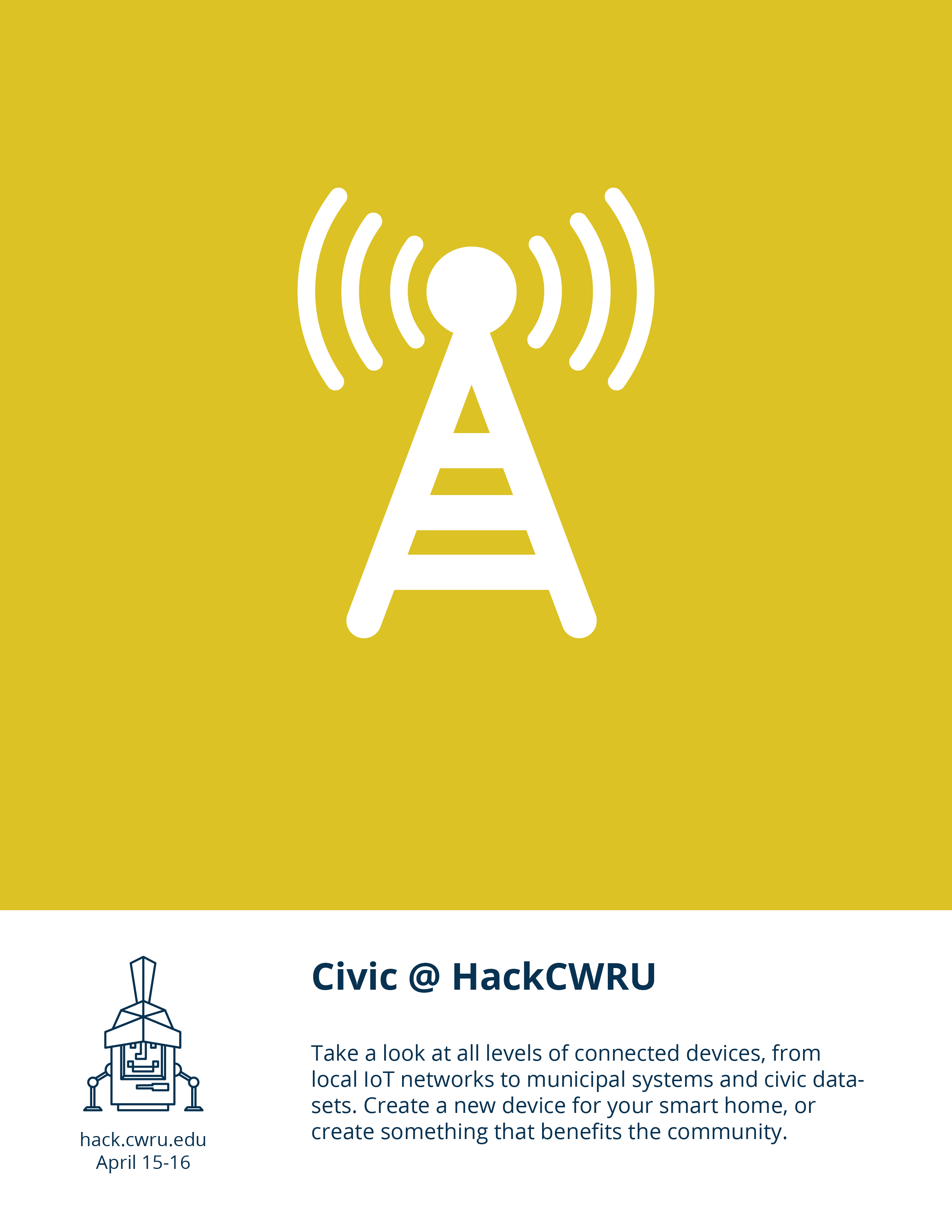
I had us bill HackCWRU as Cleveland’s premiere hackathon, partially because we are Cleveland’s only hackathon. The six tracks appealed to different sponsors in Cleveland. We wanted to highlight the diverse projects that could be created during HackCWRU; for each track, I created a separate flyer. Then, we decided we were going to hang all of our posters together.
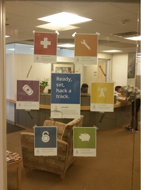
The hub in action.
The hub and spoke, as we called it, featured a HackCWRU poster in the middle, surrounded by all the track flyers. For smaller bulletin boards, we picked two or three track posters to hang next to a HackCWRU poster. Doing so let us customize the flyers for our audiences: for example, we hung mostly fintech track posters in the business building and health track posters in the med school.
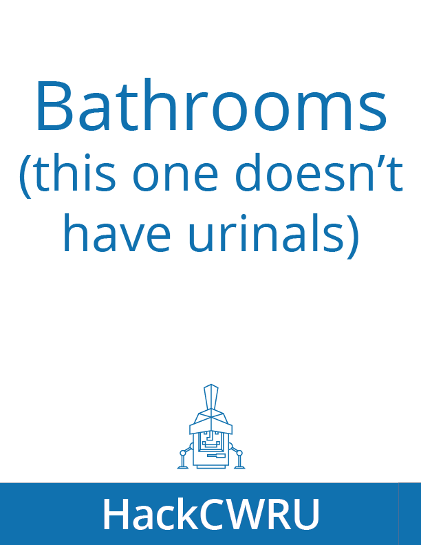
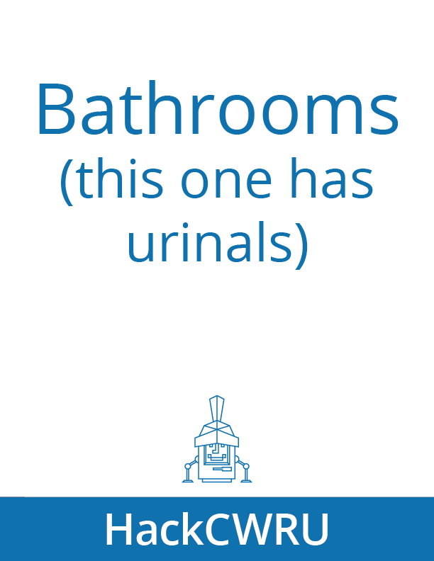
Initially, I had defined my role very narrowly so that I would have time to focus on my other responsibilities. For logistical reasons, the event date was moved back a couple of months, allowing me to spend more time on the project. I became the de facto diversity coordinator. While making signage for different event spaces, I pushed for us to create a gender-neutral bathroom. I created name tags with HackCWRU logos, then asked for all volunteers to write their preferred pronouns next to their names. I tried my best to be as inclusive as possible when designing materials.
By the end of the event, I had designed and written copy for:
-
Name tags
-
Tabloid and letter size flyers
-
A poster the size of a picnic blanket
-
Signage
-
The style guide
-
The sponsorship document
I oversaw and guided the creation of:
-
Icons
-
Stickers
-
T shirts
-
New sections of the website
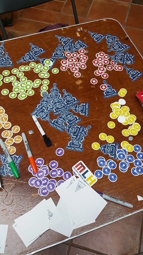
Stickers at the sign in table.
In the end, our hackathon wasn’t the most ornate, but had consistent branding and signage. People knew where they were and where to go! The elements I created this year will be a starting point for next year. We’ll be able to reuse templates and graphic elements, as well as improve and expand upon what we had this year.